A personal journey in pixels
My personal website has always been more than just a place to host projects—it’s been a space to explore, experiment, and evolve. Every redesign reflected not just where I was professionally, but also how I saw myself as a creative.
From chaotic collages to modular blocks, here’s how my site has transformed over the years.
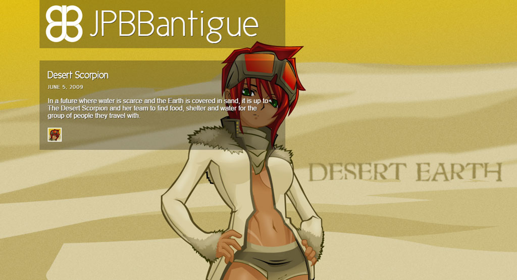
When my homepage looked like a scrapbook
This first version was raw, expressive, and deeply personal. It resembled a digital collage more than a traditional website. There were no clear sections or rules—just layers of images, textures, and playful experimentation. It wasn’t user-friendly, but it had soul.


The time I embraced minimalism and a darker tone
At some point, I wanted my site to feel more refined. I shifted to a dark theme and stripped things down to their essentials. Clean lines, simple typography, and a focus on contrast gave this version a more professional edge. It was my first step toward a portfolio-focused layout.
Trying to balance structure with personality
I missed the personal feel of my earlier design, so I reintroduced warmth and color while keeping the layout structured. This hybrid approach allowed me to showcase both blog content and artwork side-by-side. It felt more balanced—like my personal and professional sides finally found a middle ground.


Getting serious about layout and typography
This was where I got obsessed with white space and typography. I redesigned the site like it was a print zine—categorizing my work into sections like 3D, character design, and apparel. Each had its own visual rhythm, and the layout guided users through the content with intention.
Making things more dynamic and interactive
In this phase, I wanted the experience to feel more alive. I introduced hover effects, modular cards, and visual cues that made interaction intuitive. The design felt less static, more like a curated gallery where each project had space to breathe.


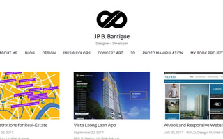
The version where UX started to matter more
Built with the help of my late friend and colleague Mel Pedron, this iteration featured a custom CMS and a minimalist layout. What stood out was its subtle attention to user experience—the thumbnail styling wasn’t just visual. Thicker shadows indicated artworks with alternate color variations, while thinner ones marked standalone pieces. It was a small touch, but it helped users navigate the collection more intuitively. Looking back, this version marked the beginning of my shift toward thoughtful, UX-informed design.
Committing to a cleaner, more modular system
Built on the Keratin WordPress theme, this version was what I internally referred to as Design ∞. It had a crisp, minimal aesthetic and allowed me to focus on both storytelling and portfolio presentation. It was my most polished iteration at the time, and it laid the groundwork for what came next.
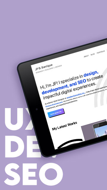
Building everything from scratch with blocks

This is the current version of my website. Launched around 2023, it’s powered by the TwentyTwentyThree WordPress theme, but no longer relies on third-party builders or external themes. I fully customized it using WordPress’s block editor.
Everything you see now—from layout to page templates—was built directly within WordPress’s native site editor. It’s fast, flexible, and finally feels like home.
And for now, I don’t plan on changing it.
About Me
I’m JP B. Bantigue, CLSSBB—a multidisciplinary designer and developer with a love for visual storytelling, user experience, and the little design details that make websites feel personal. My site has always been a reflection of where I am creatively—part playground, part portfolio. Whether I’m working with code, design systems, or custom layouts, I’m always driven by the balance between creativity and usability.


