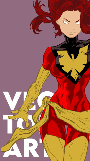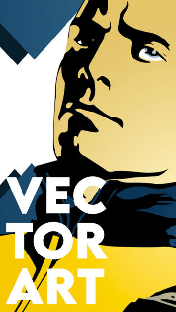
This vector art series is a tribute to X-Men: First Class (2011), reimagining key character stills as stylized propaganda posters. Inspired by the ideological conflict between Charles Xavier and Erik Lensherr, the set features three variations for each character, captured through a combination of retro poster techniques and modern vector styles. The result is a bold and expressive series of X-Men First Class posters that balance nostalgia and design innovation.
The images were vectored from movie stills and redrawn manually in Illustrator, focusing on stark shadows, bold line work, and sharp color blocking. These X-Men First Class posters pay homage not just to the film but to the emotional philosophies each character represents.
X-Men First Class Posters: Set Breakdown
Each poster was developed in three stylistic variations. The first is a faux-aged propaganda style poster using a weathered paper texture, limited color palette, and bold vintage type. The second version applies gradient shading and smooth lighting for a modern vector look while maintaining comic-inspired contrast. Lastly, the third version strips away text entirely, emphasizing minimalist storytelling through facial expression, posture, and framing.


Charles Xavier Posters
Featuring the quote “Killing Will Not Bring You Peace,” these designs highlight Xavier’s restraint and belief in co-existence.


Erik Lensherr Posters
Featuring the quote “Peace Was Never an Option,” the designs express Magneto’s trauma and militant resolve.
Final Thoughts
This project challenged me to explore advanced vector shading techniques, especially in translating cinematic lighting into flat yet dimensional forms. It became a study in minimalism and messaging. I selected quotes that reflected each character’s ideological arc and designed each version to serve a specific emotional or aesthetic purpose. The propaganda designs use typography as a storytelling device. In contrast, the textless pieces invite quiet introspection. My goal was to balance stylization with storytelling and craft an homage to X-Men First Class that feels personal yet iconic.