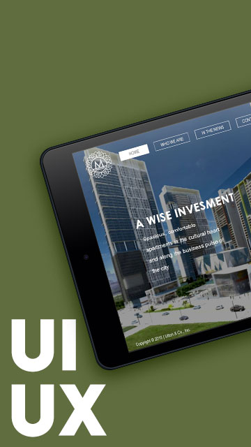
Reimagining Mobile Interfaces for High-Rise Living
The Vista Recto App was a design and development project for Vista Residences’ Vista Recto, a high-rise residential tower located in Manila. While the final build was developed using HTML, CSS, and jQuery, this portfolio entry highlights the UI/UX design studies I created for it—particularly how I translated the brand’s identity into interactive layouts that could evolve in code.
App Features
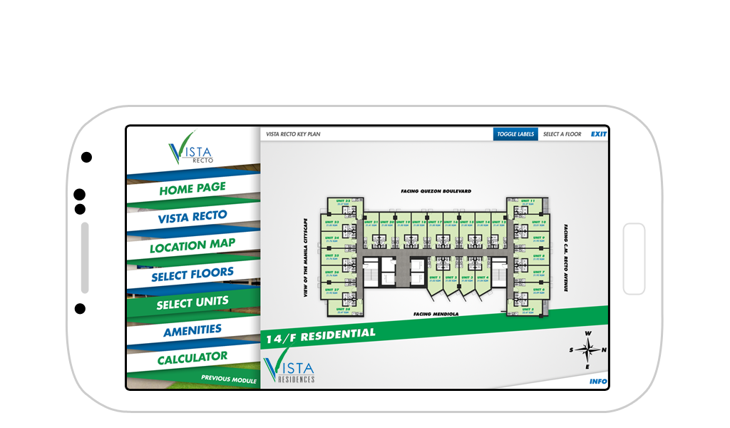
We developed the app using HTML, CSS and jQuery and deployed to both iTunes and Google Play. This app features a custom-illustrated Interactive Location Map, Interactive Building Exterior and Floor Selection, Interactive Floor Plans and Unit Selection.
The designs featured slanted, ribbon-like banners inspired by the University Series branding of the client. These ribbons weren’t just visual flourishes—they grounded the interface with dynamic visual rhythm.
Exploring Design Possibilities
I created two design variations for this app:

Vista Recto App
Interactive Floor Selection
The first version leaned into the energetic slant of the ribbon banner, with floating UI pieces and more visual layering.
Tower Floor Plan
Interactive Unit Selection
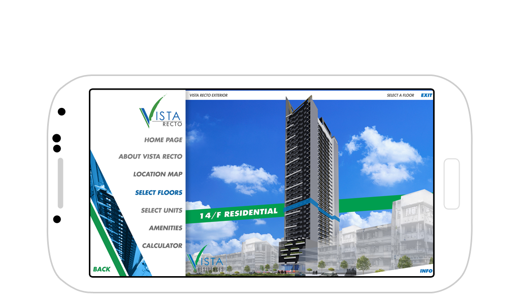
Interactive Floor Selection
Version 2
The second version, which became the approved design, simplified the approach and used the color scheme more conservatively.
Tower Floor Plan
Interactive Unit Selection

Both versions maintained core usability goals but offered different tones—from experimental and bold to grounded and accessible.
A Designer’s Playground in Code
What I love most about projects like this is the chance to blur the lines between UI design and front-end experimentation. Every interface detail sparks questions like: How would this animate on tap? Could I float this tile, or keep it anchored? What kind of easing curve would feel just right?
It’s in these quiet moments of trial and error—especially with micro-interactions—that my design choices feel most alive. This app gave me plenty of those moments.
Disclaimer: This is not a personal project but is designed under BUILD for its client/s. All images and content belong to BUILD and/or the client unless otherwise stated.