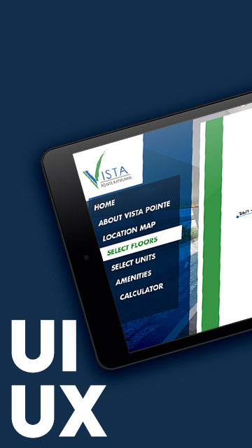
A High-Rise Project with an Unconventional UI Twist
The Vista Pointe Katipunan App is a UI/UX design study for a high-rise residential development located along Katipunan Avenue in Quezon City. The app was never developed but served as a pitch proposal, aiming to elevate the usual real estate browsing experience through interactive UI and layered microinteractions.
This design was particularly interesting for me because I wanted to break away from the rigid structure of traditional app layouts. The challenge? Explore unconventional approaches while still maintaining visual clarity and user functionality.
Exploring App Features and Layout Experiments
As with most BUILD projects, this one included a custom-illustrated Interactive Location Map, along with interactive building and floor selection, unit views, and a toggled payment calculator. I wanted to explore how far I could push interactivity and layout hierarchy within a mobile canvas—particularly in the absence of strict development constraints.
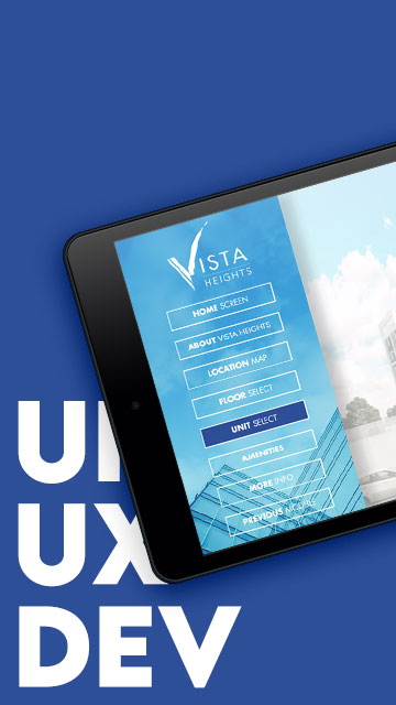
Design 1 – Floating and Freeform
In this initial variation, the app embraces a looser layout. The navigation and UI elements appear only when visible, allowing users to explore the app with minimal interruptions. The visual rhythm leans into asymmetry, floating modules, and layers that respond subtly as you navigate through the property.
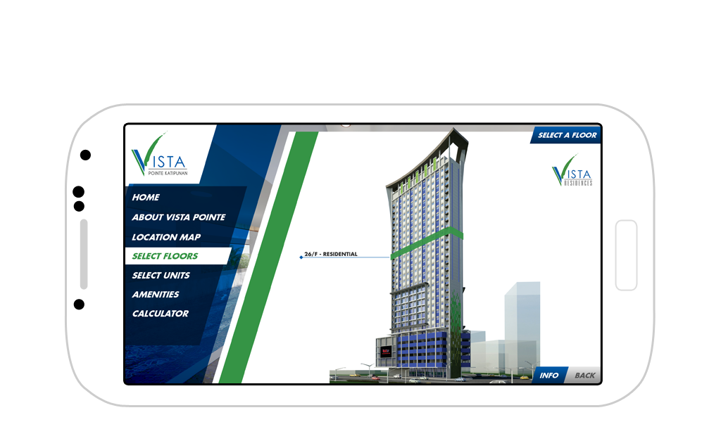
Vista Pointe Katipunan App
Interactive Floor Selection
This first variation uses an unconstrained feel where the navigation menu and UI elements appear floating when visible.
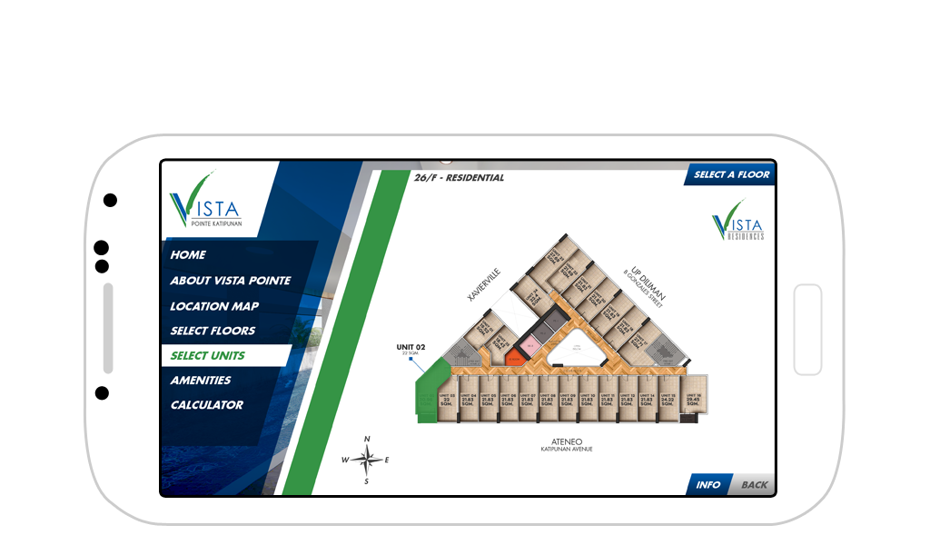
Tower Floor Plan
Interactive Unit Selection
Hotspot Galleries
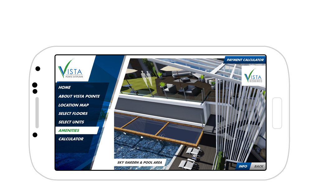
Amenities view
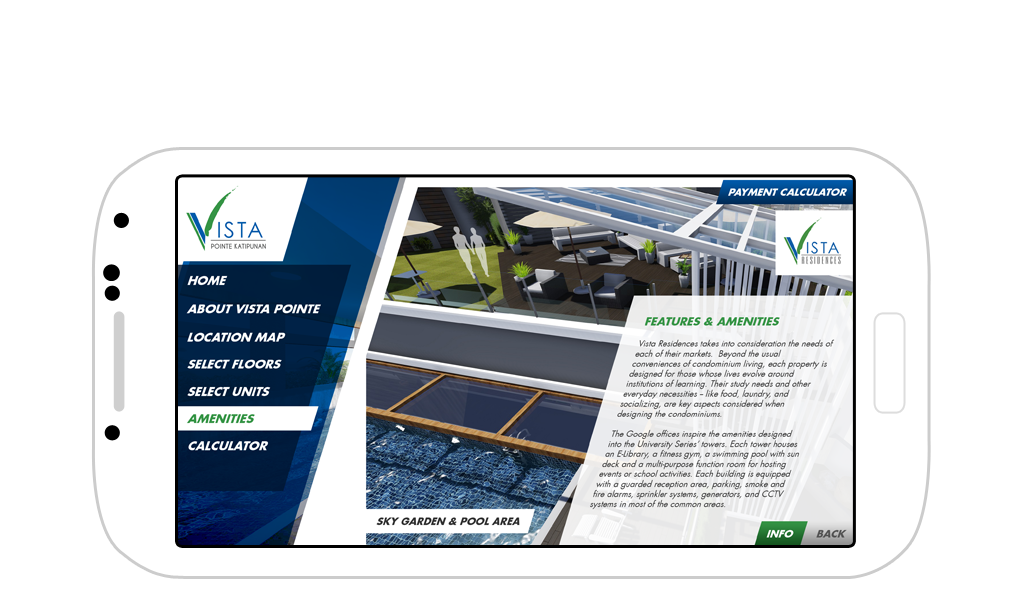
Hotspot Information
Toggle-able info box
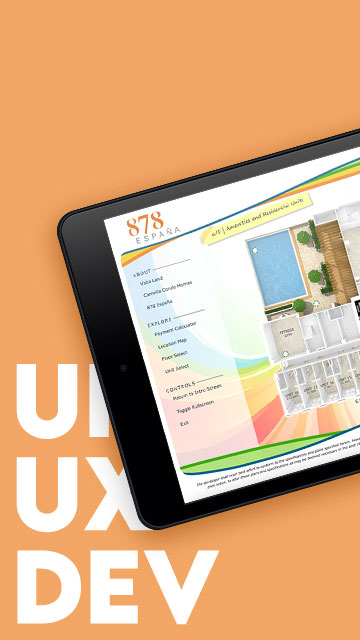
Design 2 – Refined with Compressed Layouts
The second variation takes a more grounded direction, reintroducing structure. While still keeping the ribbon-inspired slants from the University Series visual identity, this version compresses the layout for a cleaner reading space.
By simulating a fixed nav structure, I was able to test out layout constraints and user flows more typical of mobile apps, while still retaining dynamic sections for information and galleries.
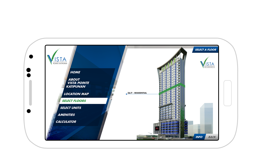
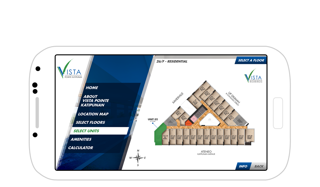
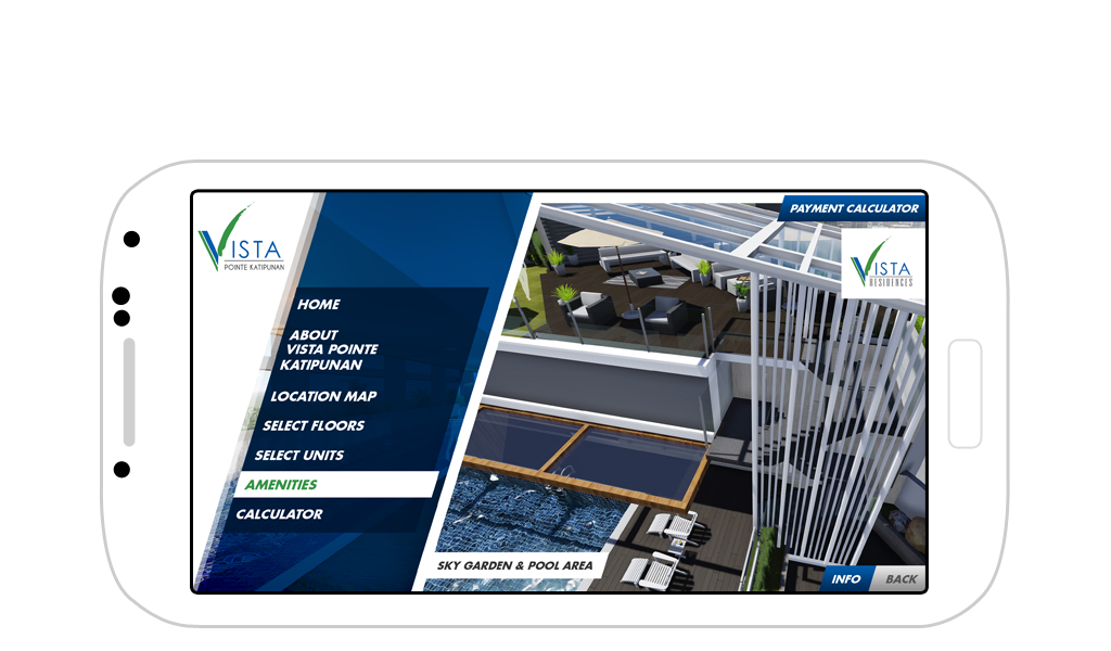
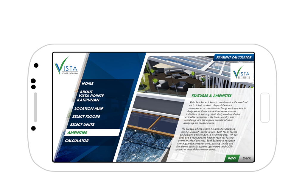
Vista Pointe Katipunan
Version 2
Just like the original version, this design uses a slanted UI but this time has a more compressed look and a seemingly fixed width navigation menu. This solves the problem that the first design faces in terms of space for the content versus space for the navigation.
Tower Floor Plan
Interactive Unit Selection
Hotspot Galleries
Amenities view
Hotspot Information
Toggle-able info box
From Sketch to Prototype – What I Learned
Working on this design allowed me to experiment with layered transitions, conditional elements, and behavioral patterns I imagined building later in code. Although this wasn’t a fully developed app, the process sharpened my front-end instincts—particularly when prototyping unconventional design decisions that might challenge default UI behavior.
Disclaimer: This is not a personal project but is designed under BUILD for its client/s. All images and content belong to BUILD and/or the client unless otherwise stated.