
Design Study and UI/UX Explorations for the Vista Heights App
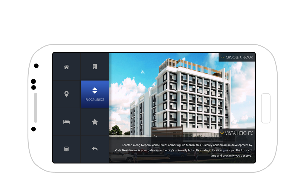
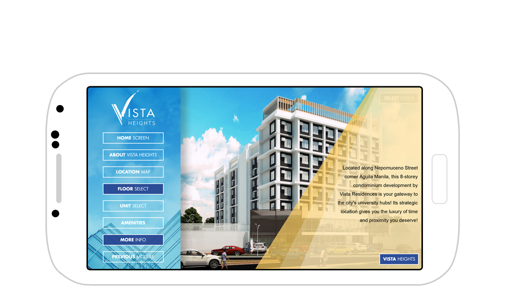
The Vista Heights App was part of a design and development initiative for Vista Residences. Vista Heights is a mid-rise condominium community located near UST in Manila, Philippines. This project explored several design studies for the app interface, all geared toward streamlining the buyer journey through interactive experiences.
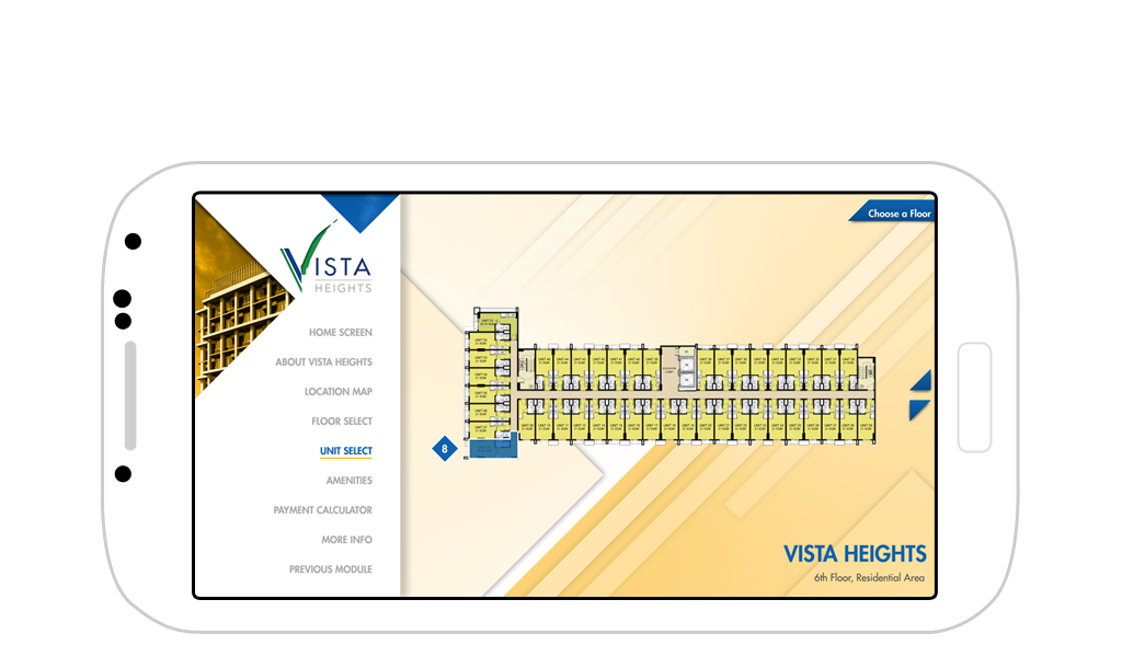
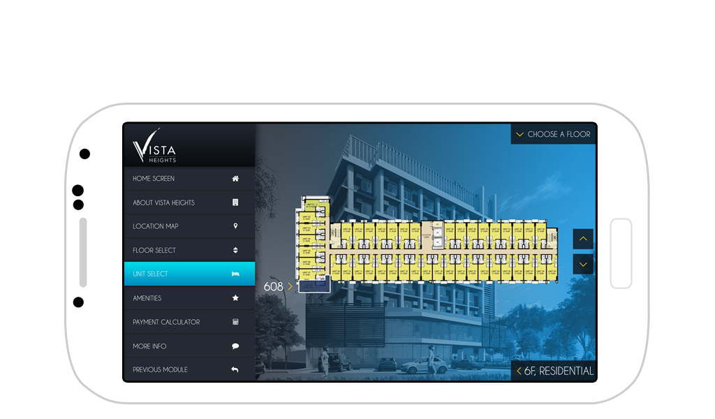
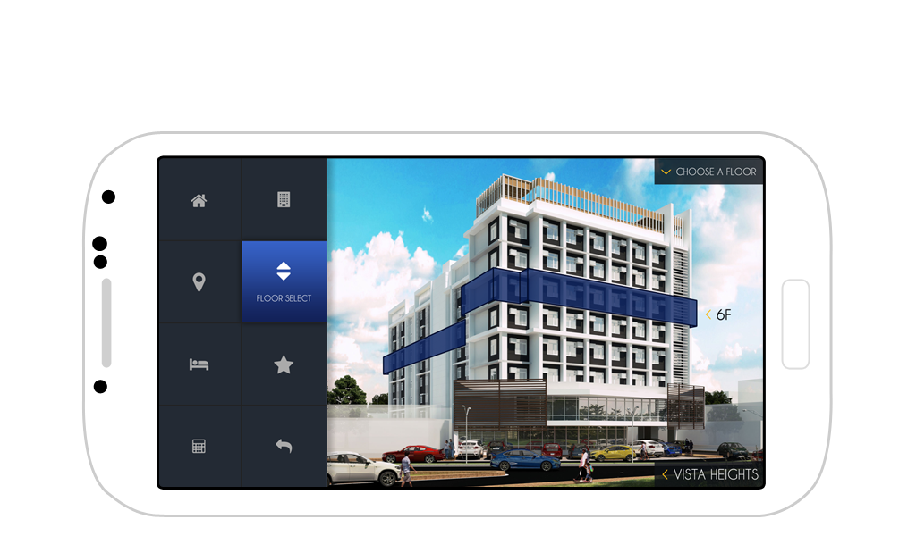
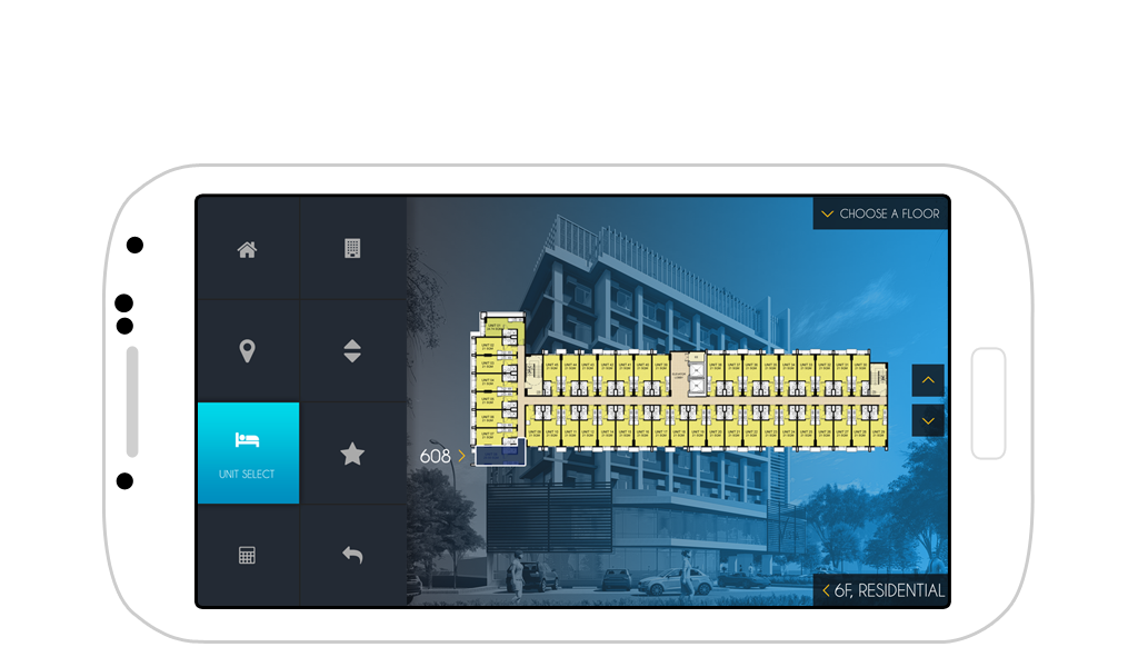
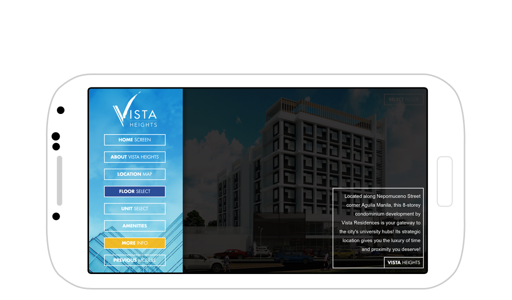
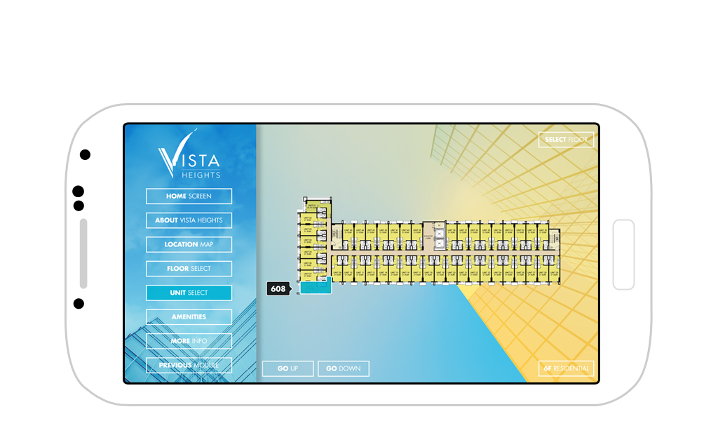
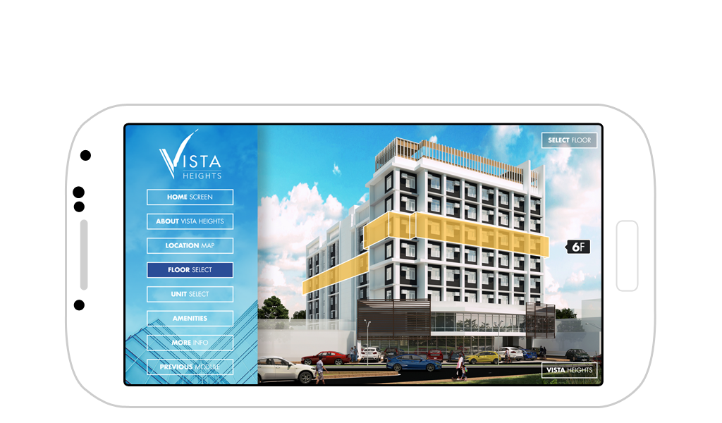
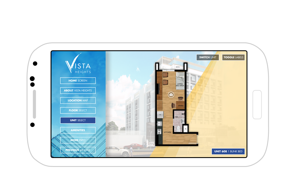
The app was developed using HTML, CSS, and jQuery. It was intended to be made available to both iTunes and Google Play. The feature set included a custom-illustrated Interactive Location Map, interactive building exterior and floor selection, interactive floor plans, and unit selection. Throughout the project, I tested several approaches to navigation structure, aesthetics, and overall flow.
Multiple UI Concepts and Final Approved Version
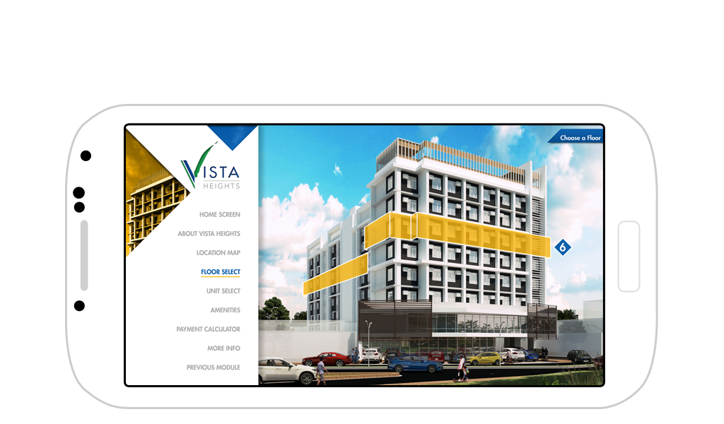
Vista Heights App, Design 1
Clean diagonal elements with minimal chrome
Goal: Set the foundation for a clean, angled aesthetic

Design 2
Dark-themed UI combining accent and neutral tones
Goal: Explore a richer, more premium interface
Design 3
Unconventional approach to sidebar navigation
Goal: Push layout structure beyond traditional patterns
Design 4
Lighter theme using ghost elements for components
Goal: Maintain cleanliness and legibility while feeling elevated
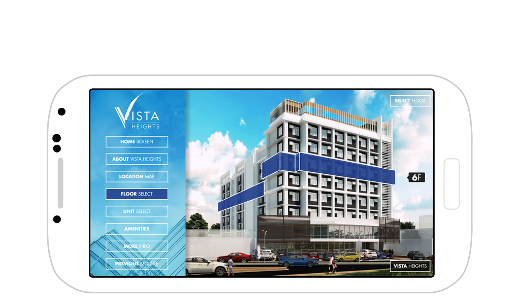
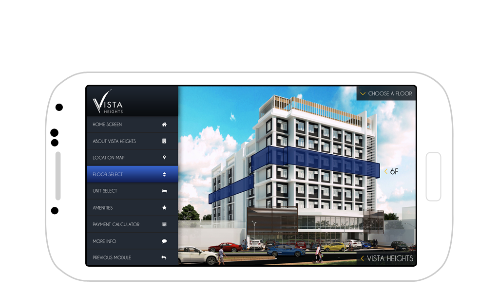
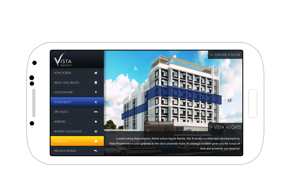
Design 5 (Final Approved Version)
An evolved version of Design 4, but with tighter controls and blue/yellow accents
Goal: Achieve balance between simplicity and branding
Development and Experimentation
I provided UI/UX design and front-end development for this project. It was a great playground for experimentation—I enjoy pushing layout conventions and imagining how micro-interactions could elevate the app experience. Whether it’s the button placement or the way banners slide into view, I’m always curious about how these nuances can shape a user’s impression.
Disclaimer: This is not a personal project but is designed and developed under BUILD for its client/s. All images and content belong to BUILD and/or the client unless otherwise stated.