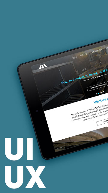
Finding Rhythm in Design: A Sonata in UI/UX
The Symphony Towers App was one of those projects where the concept practically sang to me. Developed for Vista Residences’ two-tower property in Quezon City, this app was more than just functional—it was an attempt at bringing harmony between branding and interface. The client’s theme was symphony, so I leaned into the metaphor: black-and-white piano keys became buttons, while the layout played out like a visual concerto. This was one of my earliest explorations into thematic UI design—finding ways to visually echo the branding while keeping things intuitive.
It wasn’t just one design iteration either. We went through several phases, each one fine-tuning the tone and flow until we hit the right note.
Interactive Features, Designed with Precision
I built the app using HTML, CSS, and jQuery, then packaged with Cordova for both iTunes and Google Play. Each feature was handpicked to streamline the real estate experience:
Key Features:
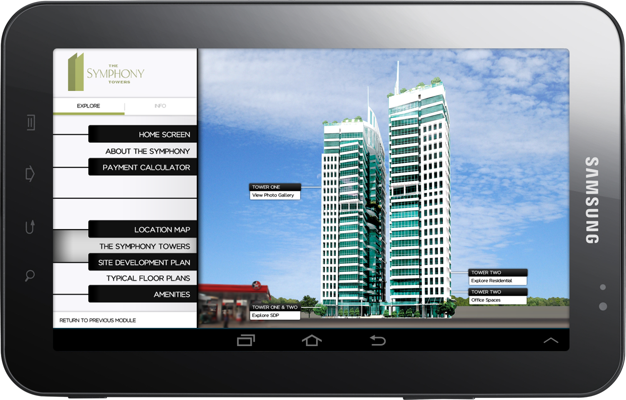
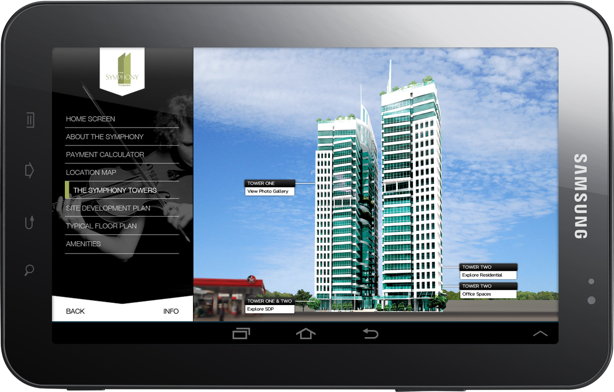
- A custom-illustrated Interactive Location Map
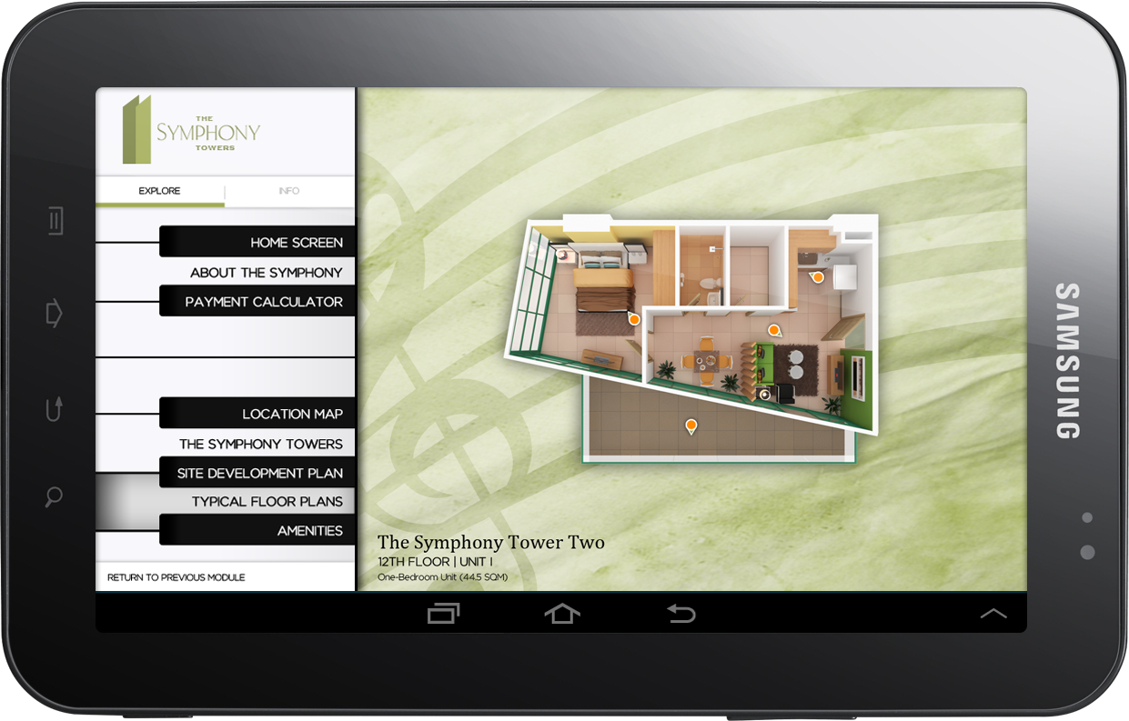
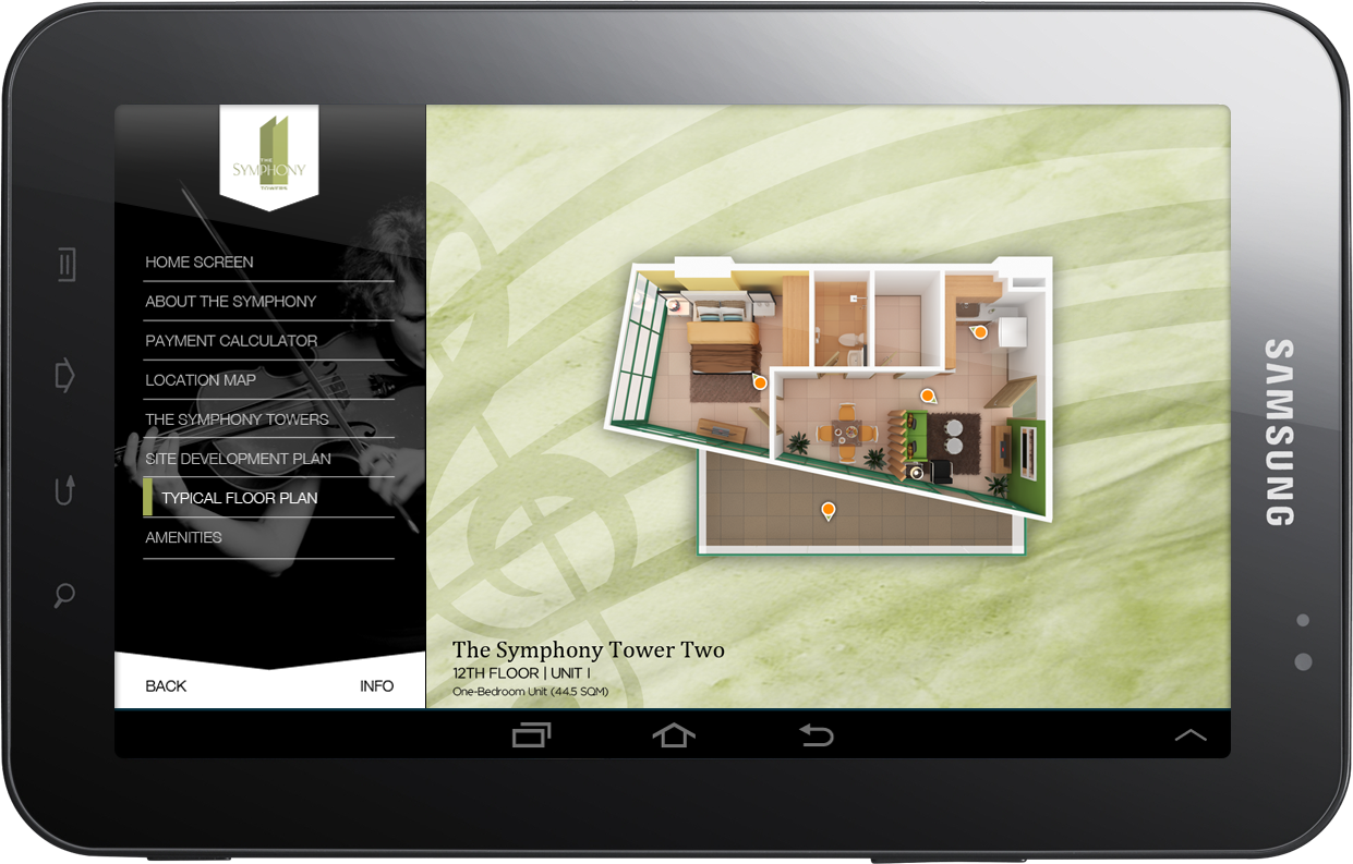
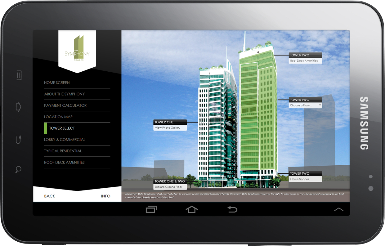
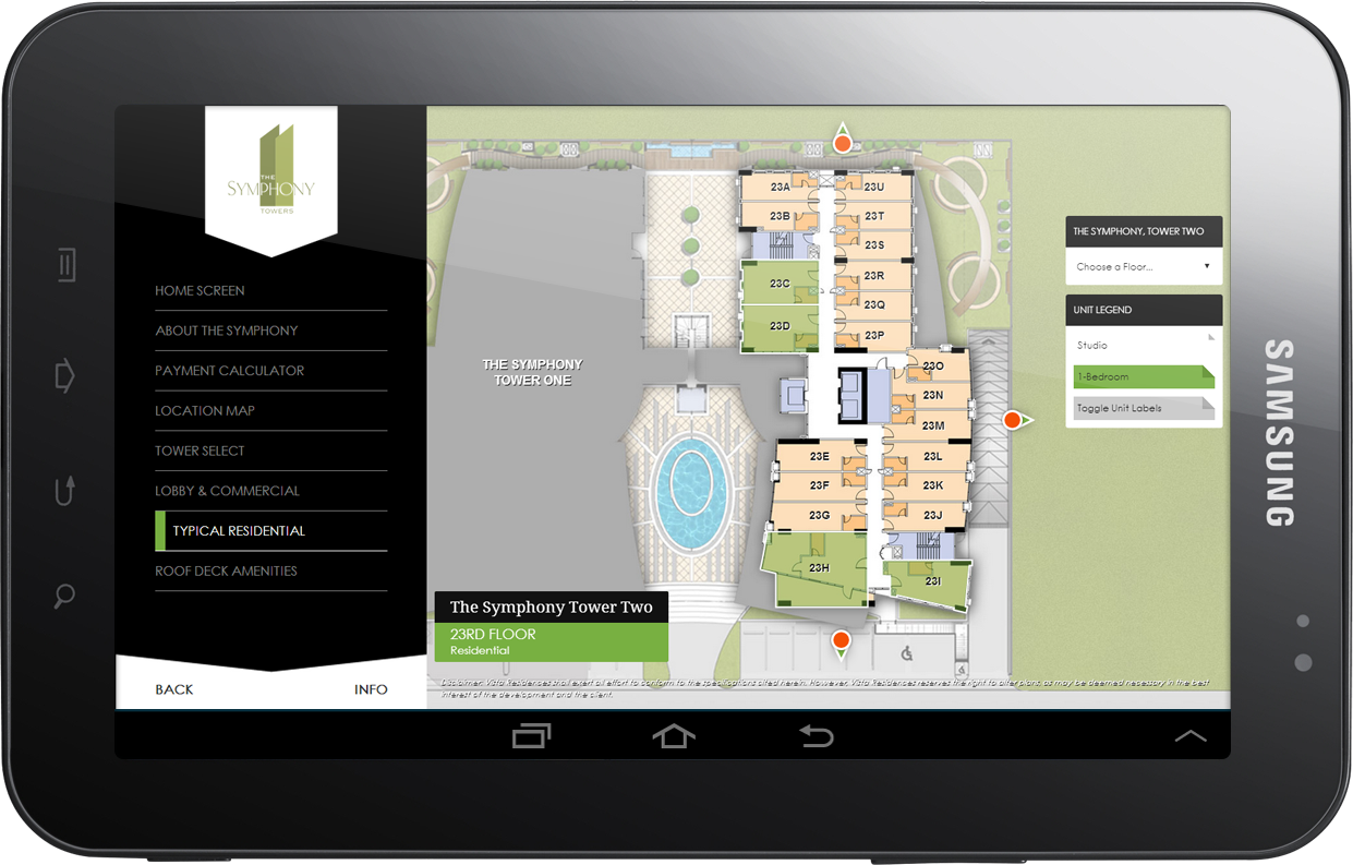
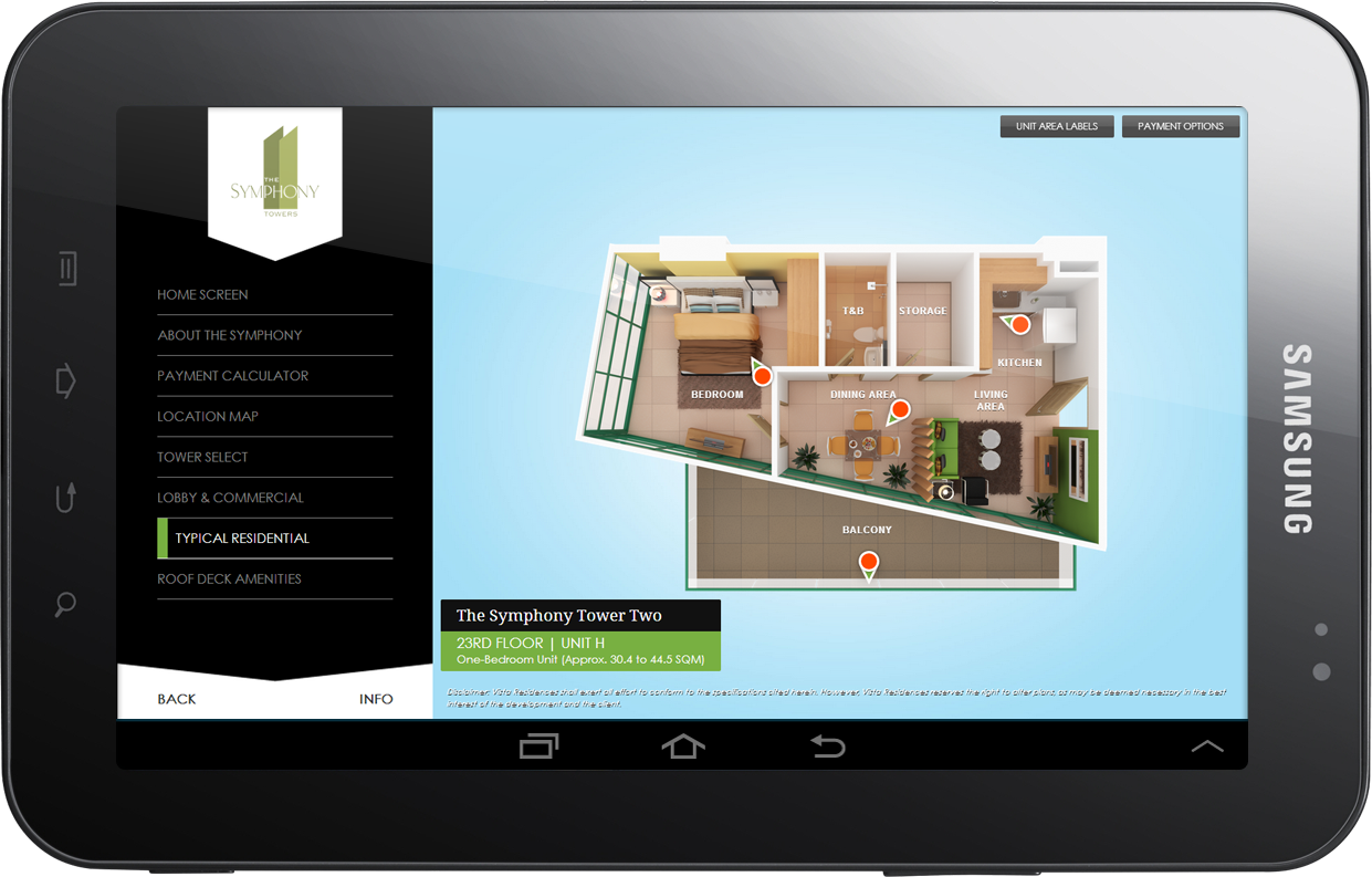
- Interactive Exterior Building View, Floor Plans, and Unit Selection
- An elegant side navigation menu designed like a piano
This wasn’t just a gimmick—the music-inspired UI helped the app feel calm, deliberate, and engaging, like flipping through sheet music at your own pace.
Mock-ups
The project went through three major design directions:
The Symphony Towers App (Initial Concept)
Inspired by the “symphony” theme, with piano key-style navigation.
Brochure-Based Design
Reflecting the visual style of The Symphony Tower’s print materials.
The Symphony Towers App (Final Version)
Approved design with a minimalist approach, keeping it clean and professional.

Disclaimer: This is not a personal project but is designed and developed under BUILD for its client/s. All images and content belong to BUILD and/or the client unless otherwise stated.