Creating a personal logo design is more than a branding exercise—it’s a creative journey that reflects your growth, values, and vision.
Over two decades, my identity evolved from handwritten signatures to geometric monograms to the current infinity-inspired logo that now represents me and my work.
Early Marks: Where It All Began (2000s–2010)
Before I created anything digital, my personal identity lived through pen and paper.
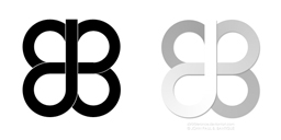
Butterfly Signature
This mark first emerged in high school. I would often sign documents or notebooks with this abstract butterfly shape—formed by mirrored Bs and flowing curves resembling a “JP.” It wasn’t designed—it just felt like mine.


JP Smiley Signature
This playful signature became my visual stamp on sketches and digital paintings—especially during my DeviantArt days.
From Doodles to Digital (2010–2015)
When I digitized my butterfly signature, it became my first personal logo design used consistently across my online presence.
My first official personal logo
At the left side is the solid version; while at the right is the gradient version with layered depth.
It worked well enough for a while—simple, symmetrical, recognizable. But as I matured as a designer, I noticed its limitations. A simple image search revealed similar iterations used elsewhere, including the TPLEX logo, which bore a strong resemblance (minus the vertical stem).
This design served me well for several years, but its generic style prompted me to explore new concepts that felt more original and refined.
The Monogram Phase (2015)
In 2015, I took a deeper dive into typographic monograms—exploring structure, symmetry, and subtle nods to my initials.
Slant // Shadow
Font: Aerovias Brasil
This was one of my early favorites. I loved the sleekness and movement, especially when the shadowed “P” transformed into a subtle “B.”
Broadway Thin
Font: Anders
These had presence and visual clarity. The balance between thick and thin strokes gave them elegance.
Fibonacci
Font: Andes
This one had potential, though the Pinterest resemblance turned me off over time.
Serif Monogram
Classic but too much like a standalone “P” at first glance.
Serif Barcode
Font: Big Calson
Strong and structured—one of my favorites. I still think this would look great as a print mark or typographic feature.
Ambigram and Pi Serif
These were more experimental—visually striking, but a bit niche for a primary identity.
Infinity Chain
Font: Lemon Milk
This one clicked. Using geometric overlaps of the letters “J” and “P,” I created a logo that resembled a continuous chain or infinity symbol. The resulting design captured everything I was aiming for—fluidity, symmetry, identity.
I used this logo from 2015 to 2023, across everything—website headers, footers, business cards, email signatures.


Infinity Refined: The 2023 Personal Logo Design (2023–Present)
When I redesigned my website in 2023, I knew it was time to update my personal logo. I wanted to preserve the Infinity Chain concept but evolve it into something more sophisticated—visually rhythmic and versatile.
The final result was inspired by retro multiline logos—those timeless, layered designs from vintage tech, sci-fi films, and analog-era branding. I combined that aesthetic with clean vector geometry to create a multi-line infinity symbol: structured, dynamic, and symbolic of continuity.
The Infinity Chain (2023-Present)
Retro-inspired, multi-line logo
The final logo (right) and cropped favicon (left) used across my site and branding.
Interestingly, when viewed from a distance, the favicon shape loosely forms a “Z”—a letter I often associate with personal characters and digital aliases.


Takeaways
Designing my logo was less about creating a symbol and more about understanding myself.
Each version represents a different season in my life—high school sketches, experimental digital art, clean monograms, and modern minimalism. I’m proud of the identity I’ve built so far—and while I’m keeping this version for now, I know that someday I might feel the urge to evolve it again.
Design is never really finished—just paused at the right moment.