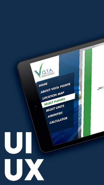
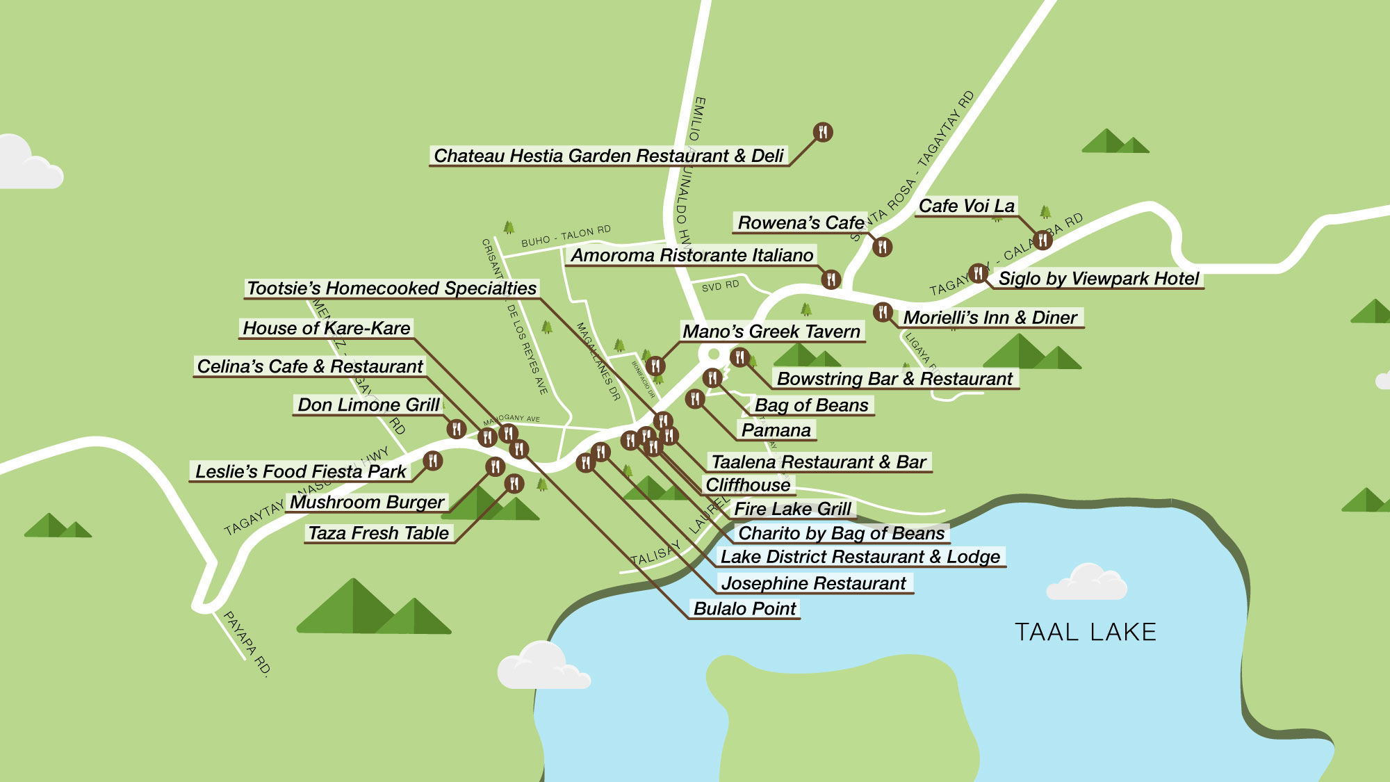
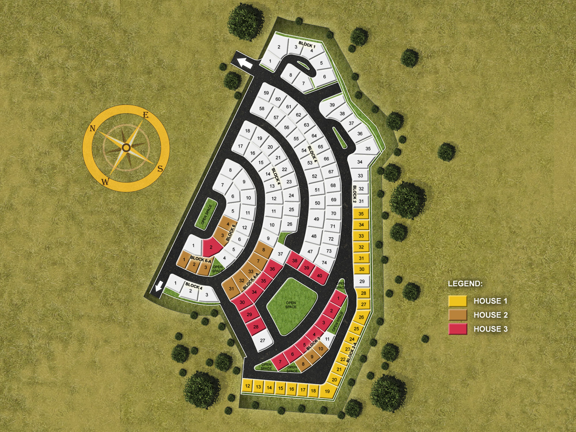
Project Overview
While working at BUILD Interactive Media Group, I had the chance to create custom map designs for various real estate clients. These weren’t just your typical static maps—each one was crafted specifically for interactive real estate apps, designed to help users explore locations, amenities, and site plans with clarity and ease.
Every map had a distinct look, reflecting the client’s branding—from the color palette to typography and visual hierarchy. Whether it was for a community development, a condo project, or a mixed-use building, the goal was always the same: make navigation intuitive, make details visible, and make the experience feel seamless.
Design Approach
- Tailored Visual Style: Each map followed the client’s visual identity, from brand colors to tone. I often had to match existing marketing materials while ensuring the maps remained user-friendly.
- Function Over Form—But Make It Pretty: These real-estate interactive maps were built for functionality, but that didn’t mean they had to look dull.
- Collaborative Workflows: Most maps were created as part of larger app development projects. Coordination with the rest of the team was key to ensuring each map met both visual and technical requirements.
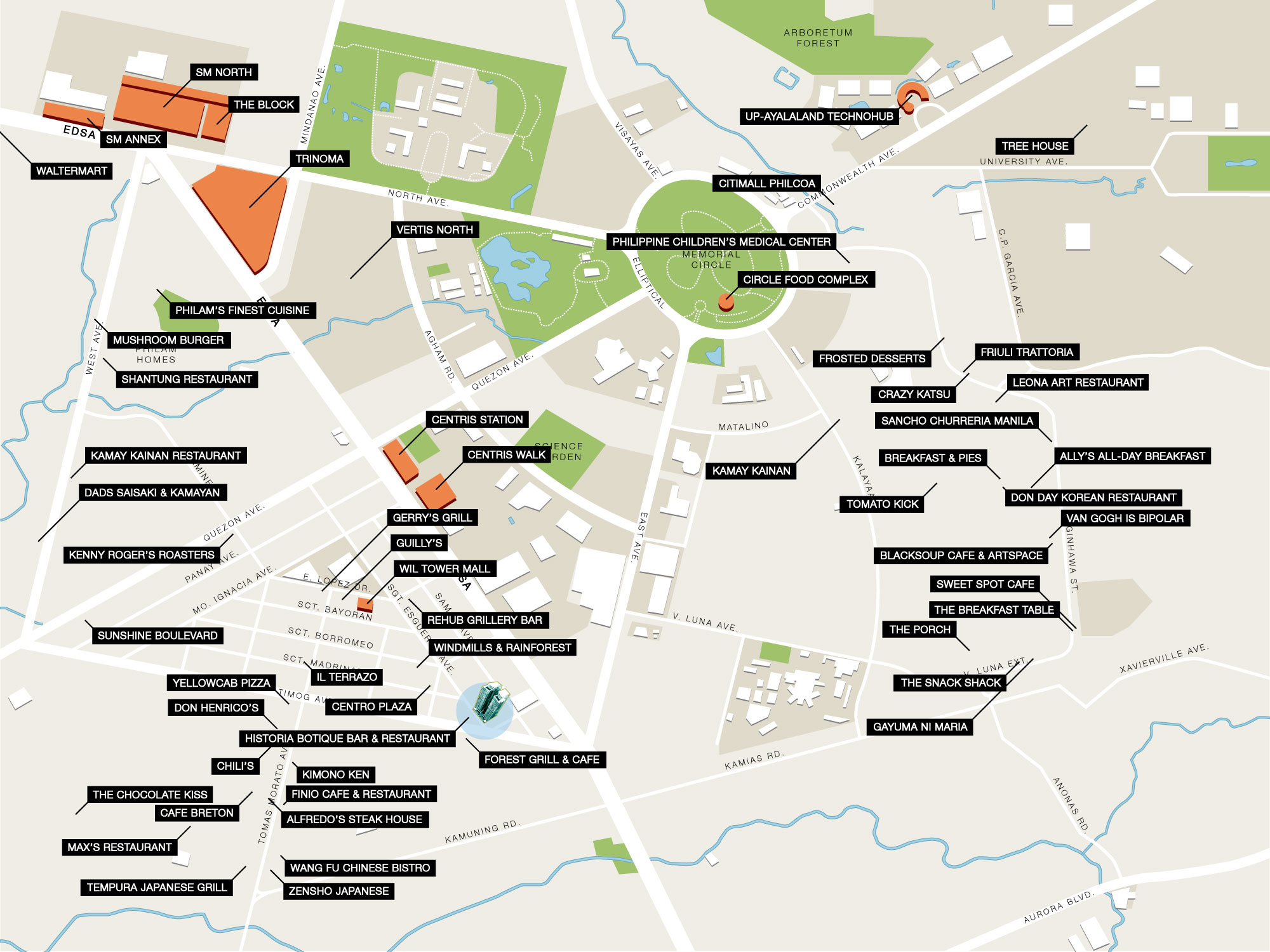
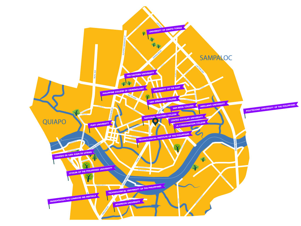
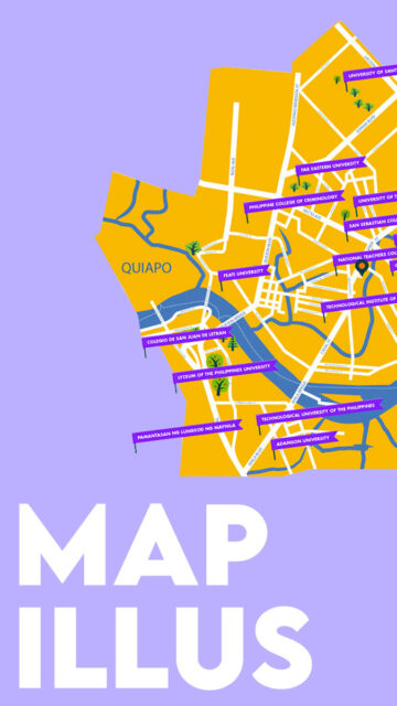
Maps for Real-Estate Projects
The Symphony Towers and Vista Heights
More location map illustrations
Pine Suites Tagaytay and Portofino
Disclaimer: This is not a personal project but is designed under BUILD for its client/s. All images and content belong to BUILD and/or the client unless otherwise stated.