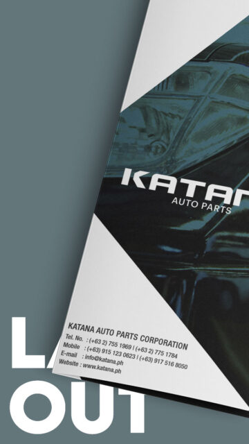
When designing for the automotive industry, clarity and speed need to drive the direction. This brochure concept reflects that spirit with a sleek and diagonal layout that creates a sense of motion from cover to spread.
Katana, now known as Blisam, is an auto parts seller and reseller based in Naic, Cavite. Regardless of how much information it needed to deliver, the goal of this piece was to create a unified brochure that looked fast, felt sharp, and stayed clear.
Inspired by the “K” in Katana
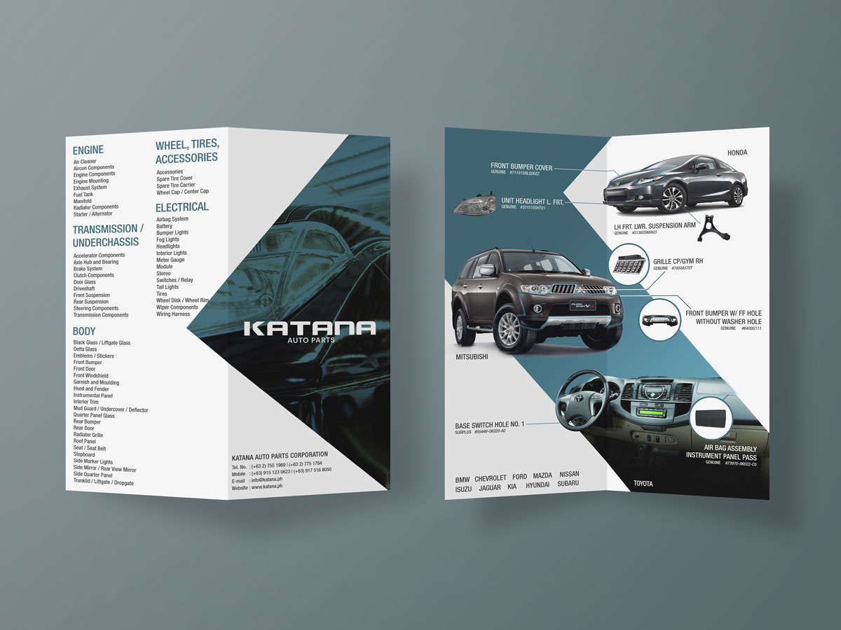
The “K” in Katana’s logo primarily inspired the brochure’s angled diagonal element. Rather than simply echoing the letterform, I used that shape to guide the layout itself. The diagonal became a motif that moved across the pages, allowing the design to “cut through” the layout and create seamless transitions between sections.
This visual thread not only unified the content but also reinforced brand recognition. Each angle and shadow worked together to give the design a bold yet coherent identity.
Katana Auto Parts Brochure
The “K” of the Katana logo primarily inspired the design direction of the brochure. The brochure features a seamless design across the different pages.
More Than Just a Mock-Up—It’s a Design Exercise in Cohesion
Developed as a layout design study under BUILD, the Katana Auto Parts Brochure explored how branding elements can extend beyond logos and colors. The result is a brochure that doesn’t just present information—it carries a personality. Every decision, from the use of bold typography to the minimal yet impactful layout, was made to echo the client’s sharp and fast-moving brand tone.
Disclaimer: This is not a personal project but is designed under BUILD for its client/s. All images and content belong to BUILD and/or the client unless otherwise stated.