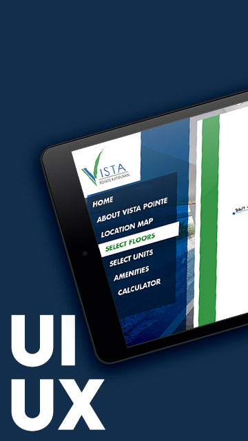
Overview
Hit the Road is a financial adventure game that takes you on a virtual road trip across the country, but the journey is not an easy one. You must save and spend your money wisely to complete challenges along the way. Originally designed as a web-based experience, the game faced UI/UX challenges that affected usability, accessibility, and engagement—especially for younger players. This case study documents the redesign process I undertook to optimize the game for mobile while preserving its core gameplay and improving accessibility.
Challenges Identified
Before redesigning the game for mobile, I conducted a UI/UX audit and identified the following issues:
- Unnecessary elements cluttered the screen, affecting usability.
- Excessive white space led to inefficient use of screen real estate.
- Clashing colors reduced visibility and accessibility, particularly for children.
- Font readability issues, making in-game text harder to follow.
These problems needed to be addressed while maintaining the integrity of the gameplay experience.
Key Considerations for Optimizing Hit the Road for Mobile
Transitioning from web to mobile required a strategic approach. Several key decisions influenced the redesign:
- Landscape vs. Portrait Mode: I analyzed the game structure to determine the best orientation.
- UI Simplification: Reducing visual clutter while retaining all necessary functions.
- Intuitive Interactions: Ensuring smooth transitions, clear navigation, and a more engaging experience on smaller screens.
Core UX Goal
To maintain the essence of Hit the Road while refining its interface for mobile, I set a primary UX goal:
Redesign the game to retain its immersive experience while reducing unnecessary UI elements and simplifying interactions.
Redesigning the Hit the Road Experience
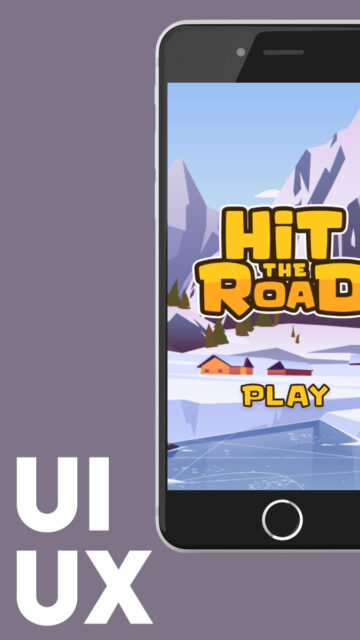
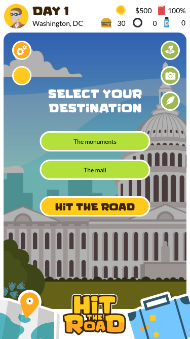
Splash Screen
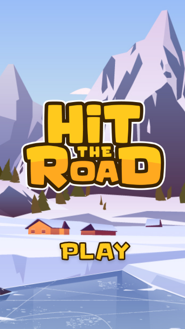
- A kid-friendly logo with a refined color palette.
- A simpler splash page that visually hints at the game’s end goal (reaching the Rocky Mountains for a ski trip).
NPC / Assistant Interaction
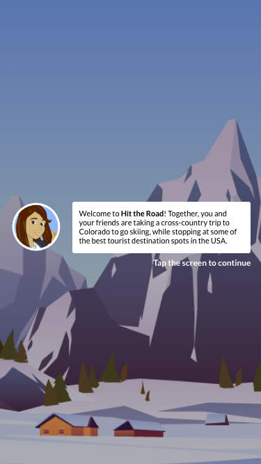

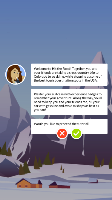
- Reduced the character’s footprint on the UI to maximize space.
- Text displayed like a messaging app for a more intuitive, conversational experience.
Character Creation
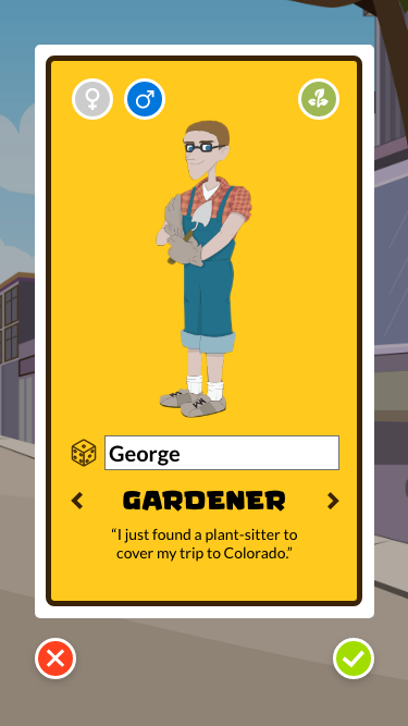
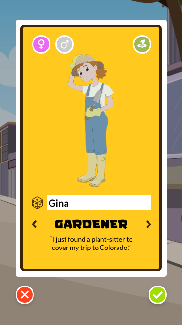
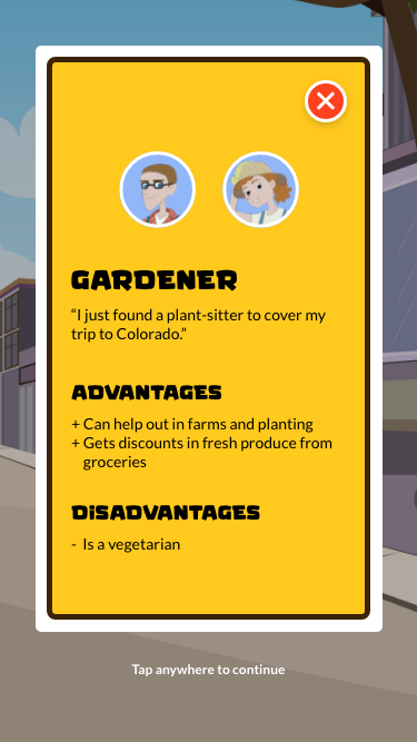
- Icons replaced text-based options for gender and occupation selection.
- Occupation advantages simplified for clarity.
- Added a default name and random name generator for better user convenience.
Game UI Improvements
- Simplified the UI by using icons instead of text-heavy descriptions.
- Consistent UI elements create a cohesive experience.
- Key stats placed at the top for quick reference.
- Character menu positioned in the top-left corner for easy customization access.
- Occupation advantages displayed clearly on the right-hand side.
- Map and Suitcase buttons function as pop-ups, reducing persistent on-screen elements.
- A new Day/Night cycle feature, with a settings menu positioned for easy access.
Status Screen Enhancements
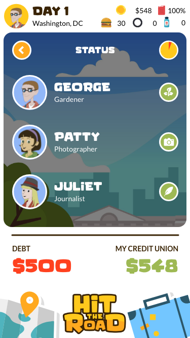
- Displays overall player status, with clickable elements for expanded details.
- Shows debt & credit summary for quick financial reference.
- Time tracking integrated, with direct access to the Map and Suitcase screens.
Earnings & Spending UI
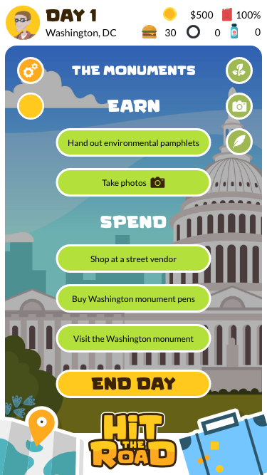
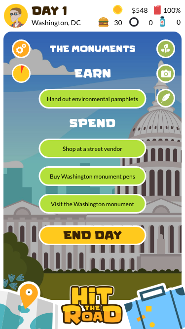
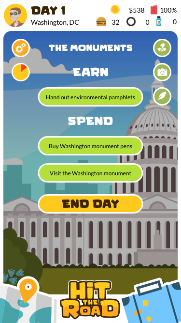
- Options feature relevant icons for quick recognition.
- Unavailable actions are greyed out, preventing unnecessary interactions.
Cutscenes for Key Decisions
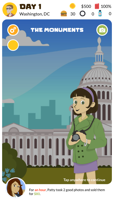
- Illustrated cutscenes for in-game actions, making decisions more immersive.
- NPCs narrate task durations and outcomes, reinforcing player choices.
- Time and currency updates appear immediately after cutscenes.
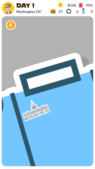
Map & Progress Tracking
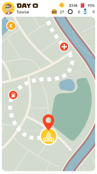
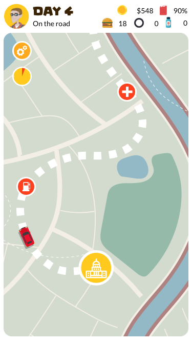
- Removed the progress bar and integrated it into the map UI.
- Map now shows real-time location tracking, with grid squares representing travel days.
- Added a scrollable map feature, allowing players to plan ahead.
- Elapsed time indicators appear when progressing in the game.
Suitcase & Badges System
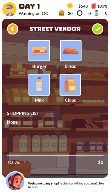
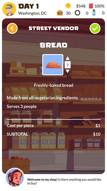
- Improved store UI, making in-game purchases clearer.
- Expanded item details, highlighting unique features and benefits.
Recommendations for Future Enhancements of Hit the Road
Beyond the initial redesign, I proposed additional improvements for long-term gameplay enhancements:
- Expanded character customization, including hairstyles, body types, and clothing options.
- Repeating odd jobs within the same in-game day, enabling deeper time management strategies.
- Enhanced day/night cycle mechanics, introducing new job availability based on time of day.
- Character disadvantages, balancing occupation advantages.
- Assigning individual characters to jobs, instead of requiring full party participation.
- Procedurally generated encounters, increasing unpredictability during travel.
- Additional cutscenes for in-game activities, such as characters handing out pamphlets.
- A set target day to reach the Rocky Mountains, adding an extra challenge.
- Inventory & souvenir tracking, enriching the in-game economy and customization.
Conclusion
This redesign successfully optimized Hit the Road for mobile devices while enhancing the overall user experience. By simplifying interactions, improving UI clarity, and introducing immersive visual elements, the game is now more accessible, engaging, and intuitive for players.