Commission and Purpose
Commissioned as an X-deal project for the UP Psychology Society (UP PsychSoc), Highway 55 celebrates the organization’s 55th anniversary. This milestone marks over five decades of camaraderie, growth, and academic excellence.
Highway 55: Full Speed Ahead
T-Shirt Design and Logo
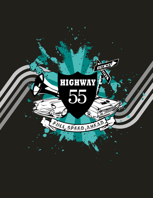
Symbolism in Highway 55’s Design
The visual elements capture the spirit of UP PsychSoc. The design blends symbolism and motion into a bold graphic statement:
- The Highway 55 emblem — Inspired by classic road signs, it represents the organization’s journey. It highlights resilience in overcoming challenges and celebrating achievements.
- The roaring muscle cars — These symbolize progress, energy, and the unstoppable drive of PsychSoc members as they move forward.
- The trident symbol — A subtle representation of psychology, intellect, and leadership, reinforcing the organization’s identity.
- Paint splatters and speed lines — These elements create a sense of motion and impact, emphasizing the organization’s fast-paced and evolving nature.
Creative Execution of Highway 55
The design uses vector-based illustration techniques. This approach ensures sharp, scalable graphics for print. The trident and road sign motif blend seamlessly with the dynamic paint splashes and speed-inspired elements, giving the design a bold, energetic feel.
Final Thoughts
Highway 55 is more than just a commemorative design. It serves as a visual tribute to UP PsychSoc’s enduring legacy. Built on intellect, community, and forward-thinking momentum, Highway 55 represents the organization’s journey—full speed ahead.
Other designs I did for UP PsychSoc
September 24, 2007
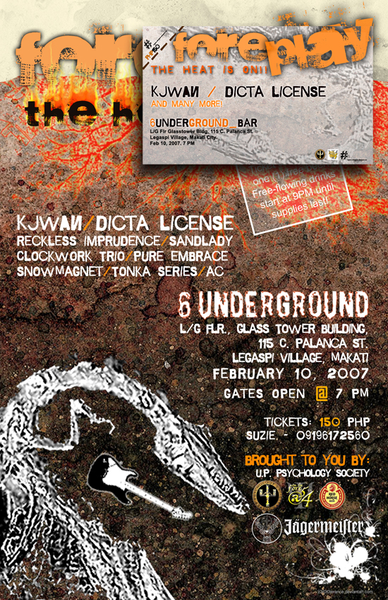
Foreplay: The Heat Is On Ticket and Poster designs