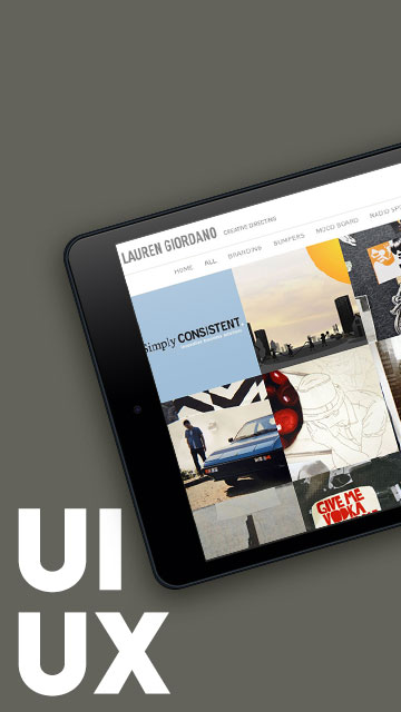
Exploring the Vision
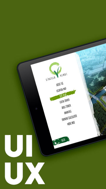
This project is a UI/UX design study developed as a proposal for Ortigas Land’s Circulo Verde app—a concept for a mobile platform supporting their 10-hectare mixed-use community in Bagumbayan, Quezon City, Philippines. While no app was actually developed, the mock-ups aimed to showcase what a digital experience for this vibrant development could look like.
The overall aesthetic draws from the Circulo Verde logo itself—particularly its sweeping, painted brush stroke. I wanted the interface to feel like a digital extension of that fluid, expressive visual identity.
Designing for Discovery and Navigation
Though just a pitch, I crafted this design with real features in mind. The envisioned Circulo Verde app included:
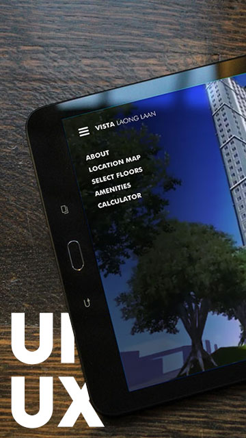
- A custom-illustrated interactive location map
- An exterior view and building selector
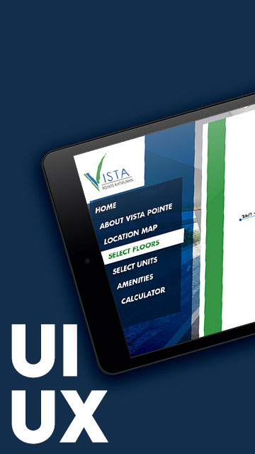
- Interactive tower, floor, and unit selection
- A payment calculator
These were designed with modularity in mind, so components could be reused across different sections while maintaining consistency and ease of use.
Visual Highlights from the Mock-ups
While simplified for the pitch, the overall design balanced clarity with visual storytelling—keeping the UI clean yet engaging, with consistent color palettes and intuitive tap targets.

Circulo Verde App
Interactive Tower Selection
Exterior View
Interactive Floor Selection

Reflecting on the Process
Projects like this allow me to push my design thinking further. Even though it wasn’t developed, the Circulo Verde app helped explore how digital tools can support real-world property exploration—and how branding can inspire user experience.
Disclaimer: This is not a personal project but is designed under BUILD for its client/s. All images and content belong to BUILD and/or the client unless otherwise stated.