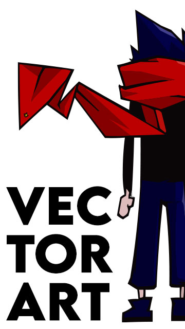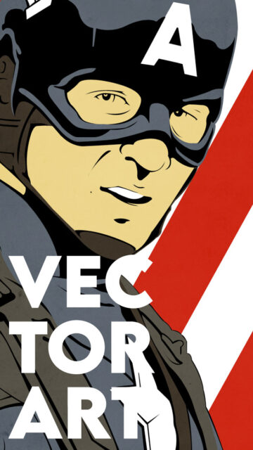
This vector series pays tribute to Captain America: The First Avenger (2011) by reimagining iconic stills as propaganda posters. Featuring four vector art variations each for Captain America and Red Skull, the set explores how design influences perception. Both characters are redrawn in stark, bold styles that reference real wartime propaganda—limited palettes, clean shadows, and simplified shapes. These Captain America propaganda posters reinterpret heroism and ideology through strong visuals.
Although both heroes and villains appear in the same universe, their posters follow contrasting design goals. Captain America’s set embodies hope and service, while Red Skull’s variants project dominance and terror. Each design challenges the viewer to reflect on the power of visuals in shaping belief.
Captain America: The First Avenger Posters – Set Breakdown
Each poster series contains four iterations:
- Flat Noir Variant – Limited colors and hard-edged lighting create a classic silhouette look.
- Enhanced Color Variant – Adds costume tones while maintaining vector shading.
- Posterized Flag Variant – Introduces bold backgrounds, like stripes or fields of red.
- Full Propaganda Poster – Features wartime slogans and typography to complete the message.
Together, these posters show how mood shifts through composition, framing, and text. Even small changes—like color or layout—can dramatically alter the viewer’s experience.


“America Wants You”
This series emphasizes the evolution of Cap from soldier to symbol. The first variant echoes classic recruitment posters, mirroring World War II’s iconic “Uncle Sam” call to arms—but with a modern comic-art twist. Cap’s calm gaze and commanding presence reinforce the ideals of protection and service.


“Victory Through Extermination”
Red Skull’s series leans fully into totalitarian design language—unapologetically bold and sinister. Harsh reds, militant posture, and dominating angles are paired with propaganda slogans to reflect authoritarian ambition. The initial variant is intentionally unsettling, with visual cues pulled from fascist poster layouts.
Final Thoughts
This project pushed me to explore advanced vector shading and minimalist storytelling. I focused on expression, lighting, and silhouette to strip each character down to their visual essence.
To balance ideology and design, I assigned each quote and layout based on narrative alignment. Captain America’s posters invite trust and introspection. Meanwhile, Red Skull’s set warns of unchecked ambition and propaganda’s dark side.
Although both sides use similar graphic tools, they produce radically different emotions. That contrast is exactly what made this project so enjoyable to build.