Rethinking the Website from a Designer’s Lens
The BUILD Website Redesign was my own personal take on how the company’s website could evolve. Originally, the 2015–2016 version was developed as a side project between myself (handling front-end development and design) and Mel Pedron (managing the back-end). It served its purpose well at the time—but over the years, it began to feel dated and too boxed-in for what BUILD had grown to become.
So in 2016, I imagined what a sleeker, bolder, and more modern version might look like.
Designing with Intent: Clean, Modern, and Service-Oriented
In this personal redesign study, I focused on the keywords: modern, sleek, and professional. The layout emphasized BUILD’s core services, past projects, and team, while maintaining visual clarity and storytelling through hierarchy.
- The navigation was simplified.
- The home banner transitioned into key value props.
- The layout introduced interactive elements like client logos, project filters, and a focused contact section.
Compared to the original, boxy design that left too much white space unused, this version felt more dynamic—yet still grounded in function.
A Nod to the Past, But Eyes on the Future
The original 2015–2016 version, featured on the left, was a collaborative effort and an important milestone for us at BUILD. But this redesign reflects how I wanted the site to evolve with the company—visually streamlined, more aligned with the needs of a fast-moving digital landscape, and more confident in its brand voice.
Though the design wasn’t taken to development, it marked an important step in my creative growth and vision for user-centered digital experiences.
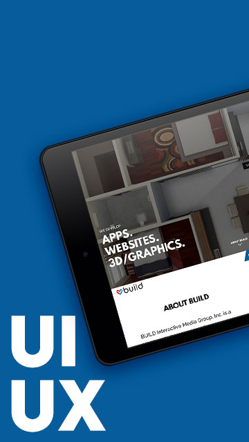
BUILD Brand Identity
Home Page
Before I even jumped into layouts, we explored ways to refine the BUILD brand identity. The heart-shaped logo mark was always a defining feature—symbolizing passion, collaboration, and creative care. This collage shows some of the early iterations and final applications, including color studies, stylistic experiments, and mockups of business cards using the new brand.

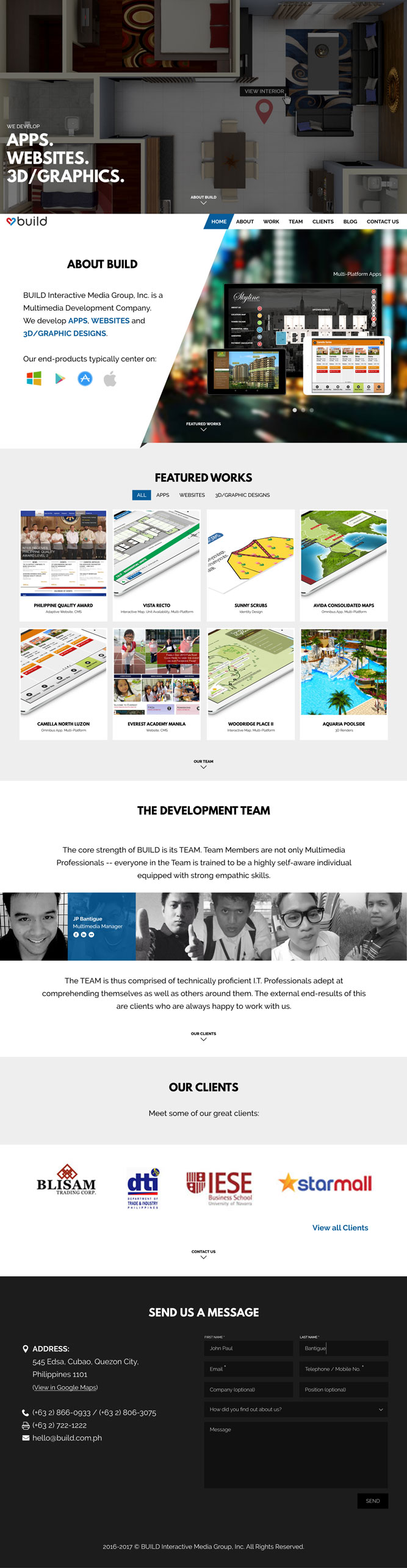
BUILD Website Circa 2015-2016
Home Page
This website which I helped develop for front-end, alongside Mel Pedron on back-end, had already served as our functional marketing site for a time.
The design reflected what we knew then: colorful, boxed layouts and print-inspired visual motifs. But like many early builds, it quickly felt dated.
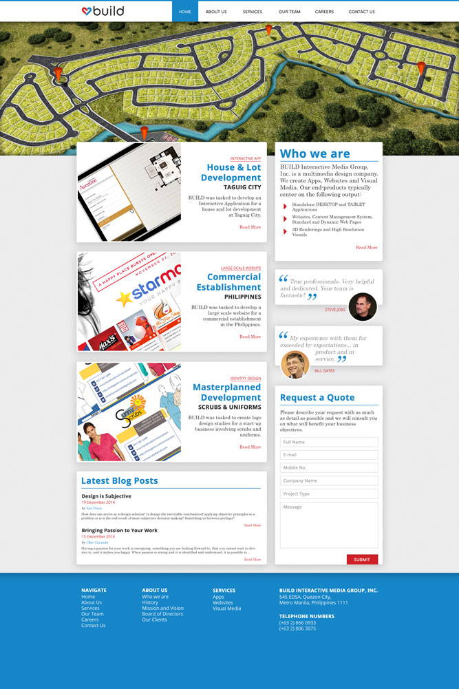
BUILD Website Redesign and Identity Design
A modern and fresh take
By contrast, this version leaned into a more modern UI direction using keywords like edge, sleek, and professional. The goal was to highlight BUILD’s product and service offerings more effectively while giving the team its own space on the page.
Some key design decisions:
- Full-width layout with clear sections
- Updated hero section to anchor the page
- Featured works displayed using large, interactive tiles
- Modular breakdown of services and dev team
- Compact client section and contact form that fit within one scroll