Project Background
When RR approached me to create branding for his business Blue and Yellow Diecast Toys, I knew it wasn’t going to be just another logo design. This wasn’t a startup still figuring itself out—this was a personal project that had long since grown into a collector’s haven. Based in the Philippines, Blue and Yellow caters to a mix of diecast car collectors, hobbyists, and kids looking for scale models—especially those who own the actual cars they’re replicating in miniature.
What stood out immediately was the name. Blue and Yellow wasn’t a random color pairing—it had history with RR. It was a name he’d used across earlier endeavors, so I felt it deserved a thoughtful visual system that would reflect more than just product type. It had to reflect balance, complement, and character.
Concept & Creative Direction
The design process initially focused on emblem-style logos—realistic, automotive-inspired marks featuring an SUV illustration. These grounded the branding in the product itself and made sense for the kind of diecast models Blue and Yellow offers. I explored different layouts: circular logos, shield forms, even layered typography that felt badge-like.
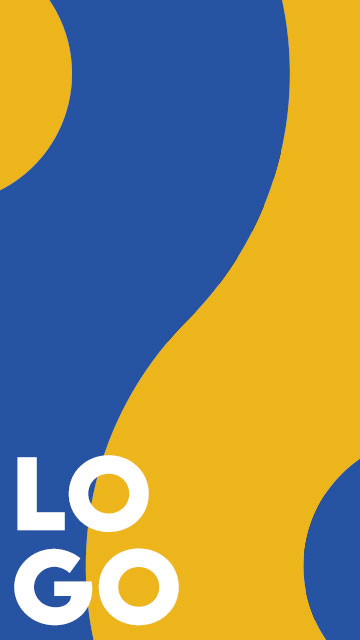
But things shifted when RR mentioned he wanted something more abstract—a logo that could be used anywhere, from packaging to stickers to online platforms. That’s when I started thinking about Yin and Yang.
The name Blue and Yellow already suggested duality and complement. And in the Yin Yang, I saw a symbol that wasn’t just about balance—it was about coexistence. These colors couldn’t exist in the logo without one another. So I began abstracting the symbol, isolating forms from the classic shape, rotating them into diamonds, squares, and hexagons.
Blue and Yellow = Yin and Yang = R and R
What surprised me was how the forms—once pulled apart—began to resemble two R’s facing opposite directions. It was subtle, but it tied back to RR’s initials. That became the seed for a more adaptable, symbolic identity that felt both personal and flexible.
Execution & Applications
Beyond the logos, I also developed:
- Business card mockups that used the isolated emblem as a visual anchor
- ID badge designs for internal or event use
These items helped RR visualize how the branding could scale—pun intended—across real-world applications while still maintaining the clean, automotive-inspired vibe.
Final Reflections
This project reminded me that branding isn’t just about color or shape—it’s about story.
RR’s long-standing use of Blue and Yellow already carried weight. All I had to do was translate that meaning into a system that could grow with the brand.
From Yin Yang metaphors to R-shaped abstractions, the branding for Blue and Yellow Diecast Toys is more than a logo—it’s a miniature celebration of balance, motion, and identity.

