A Strategic UI/UX Refresh for a Real Estate Brand
This Alveo Land website UI/UX design was developed under BUILD Interactive as a proposed improvement to the existing Alveo Land website. The goal was to enhance usability and bring its interface in line with sister company Avida Land, while reinforcing brand consistency and improving overall flow.
As one of the country’s leading real estate developers, Alveo Land deserved a digital platform that could match the innovation it brings to its physical communities. This UI/UX design aimed to support that by prioritizing clarity, modularity, and modern aesthetics.
Modular Mockups and Layout Proposals
The design system proposed included the following modules and layout variations:
Alveo Land Website
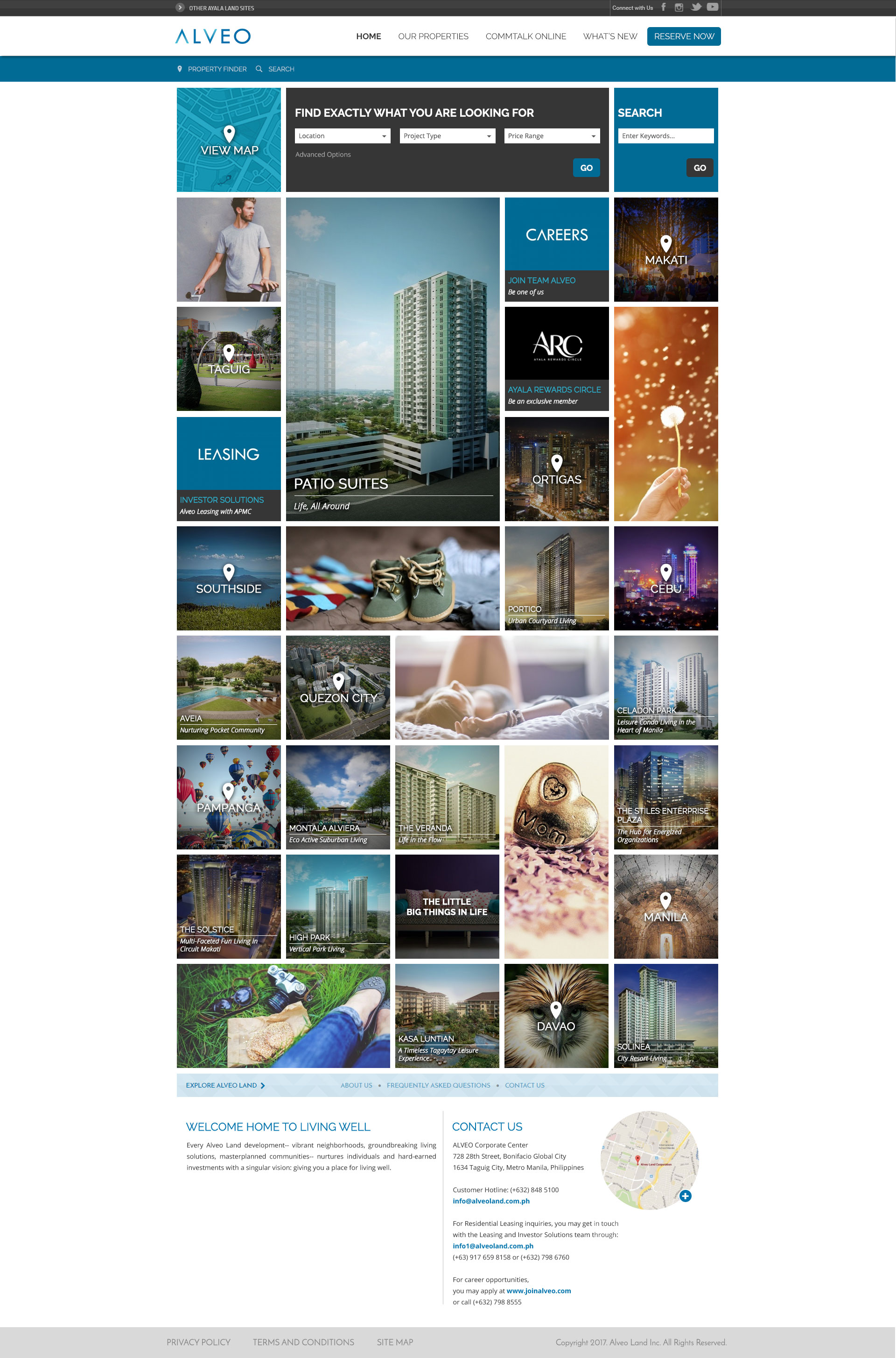
Home Page, Full Layout
To improve visual hierarchy and branding consistency, the Home Page underwent a full relayout. It incorporated patterns from the Avida Land website, especially within the menu and property search bar. This visual alignment communicated that both brands belong under the same corporate umbrella.
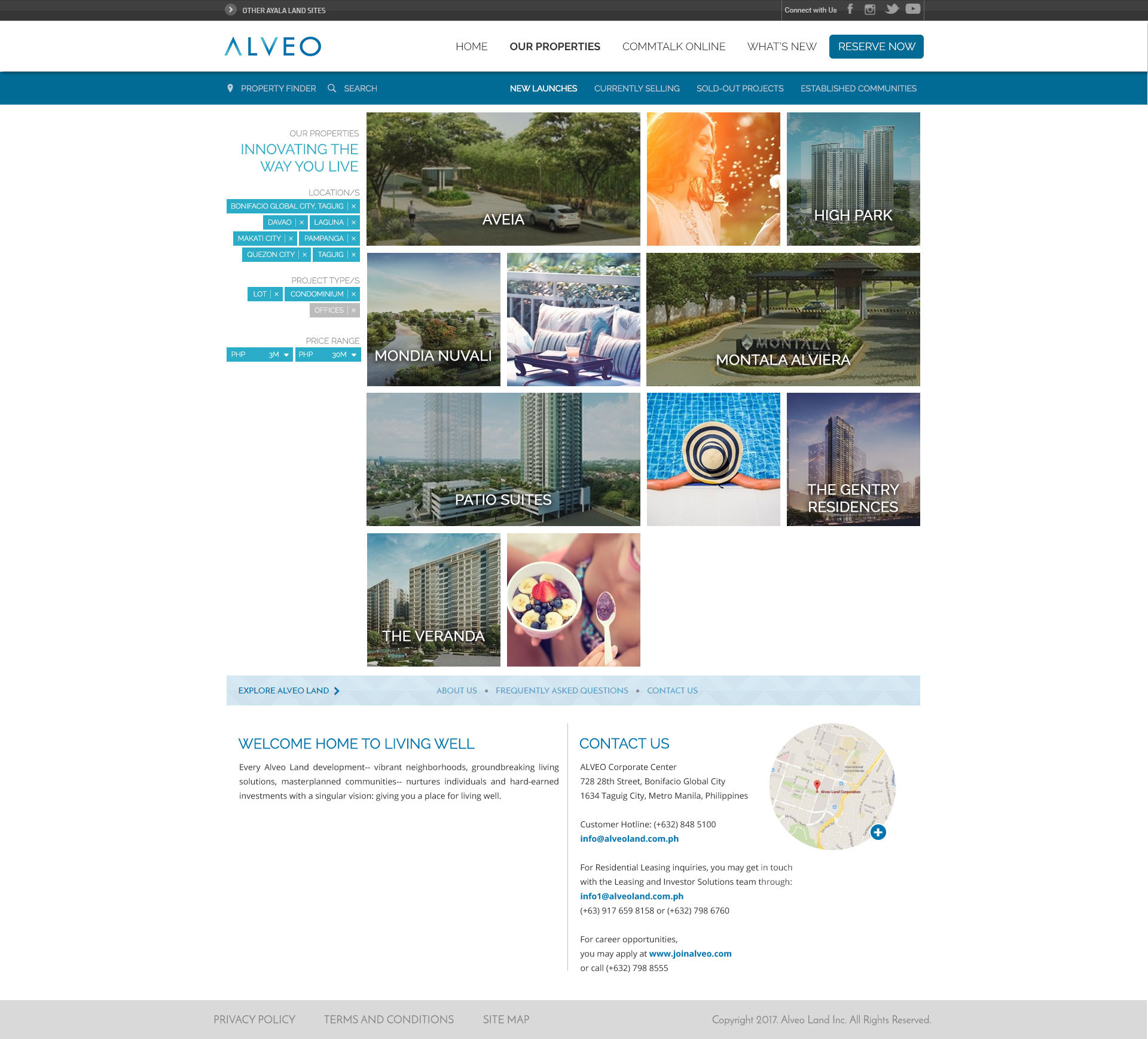
Property Listing page
Mosaic waterfall layout
This section introduced a mosaic waterfall layout. Users could filter listings using tags, while the preview mode helped guide focus. Hovering over an item revealed a parallax-styled image effect—subtle but effective for emphasizing featured properties.
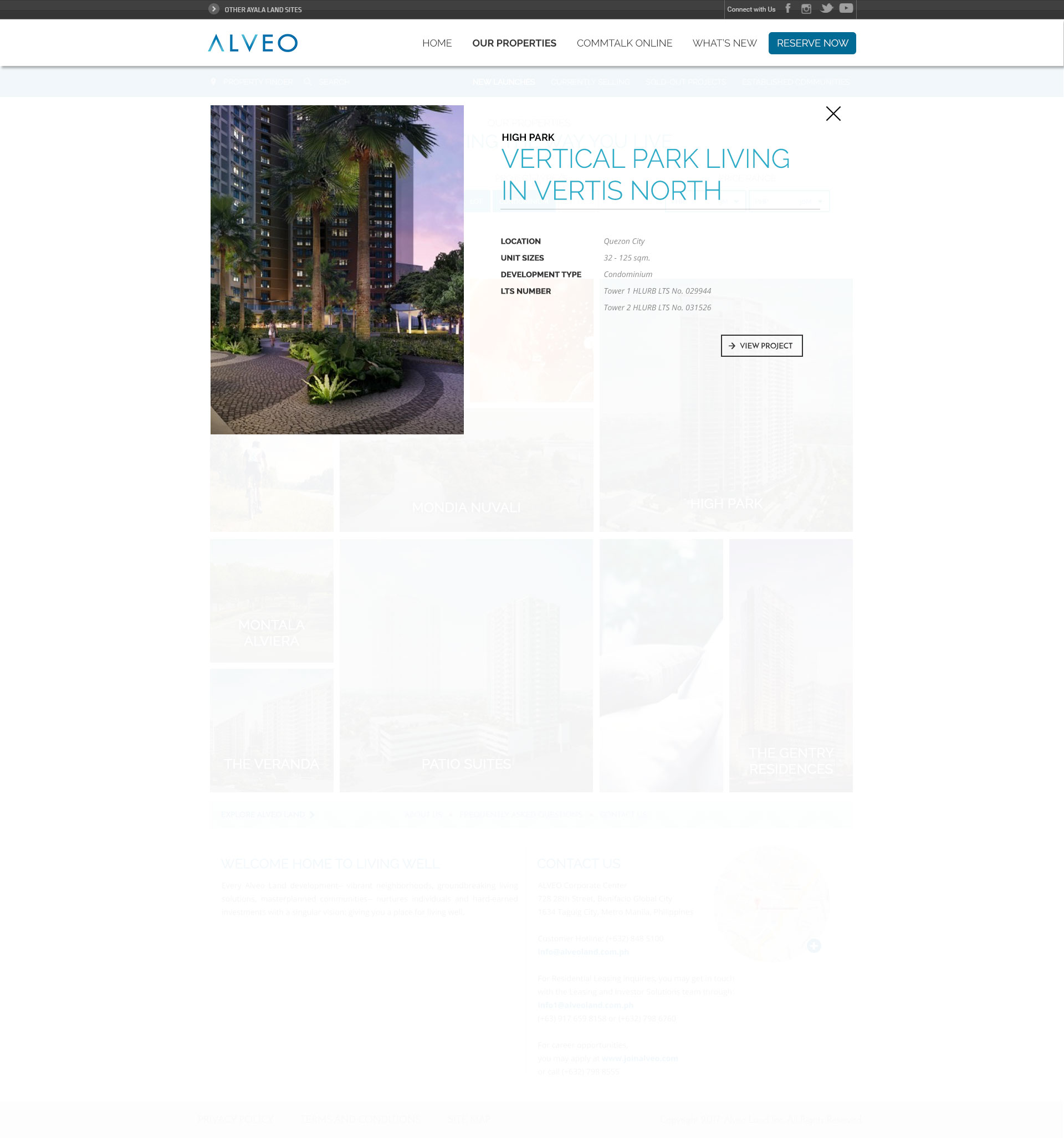
Alveo Land Website Property page
Variation 1
This version followed a single-page layout, embracing floating boxes and large visuals. The idea was to simulate a print-magazine feel. All walkthroughs and galleries connected through a Photoswipe gallery, streamlining user access to key content.
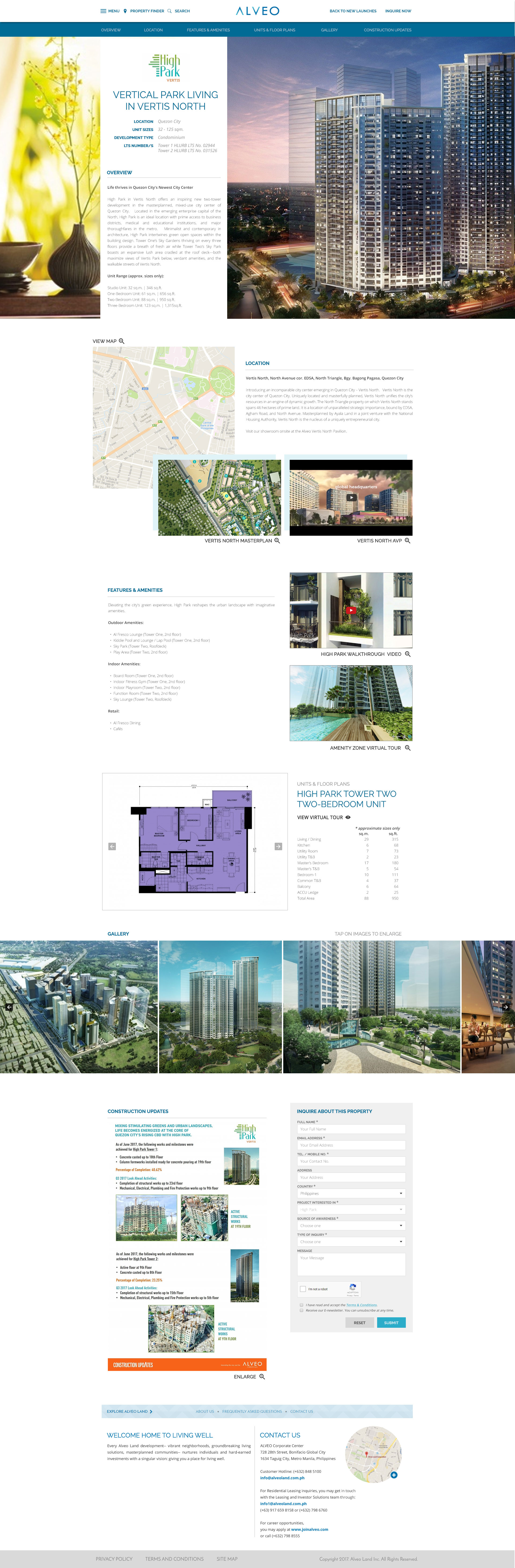
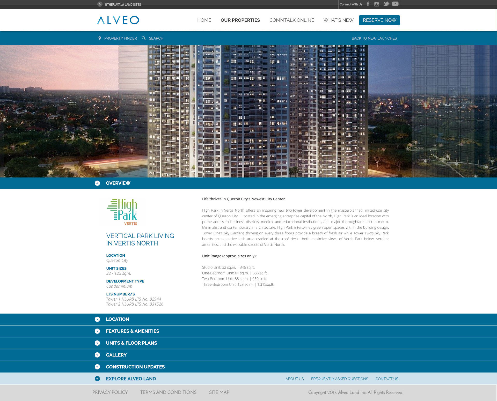
Property page
Variation 2
Alternatively, this layout used accordion-based sections, which kept the interface compact and user-friendly—especially useful for mobile responsiveness.
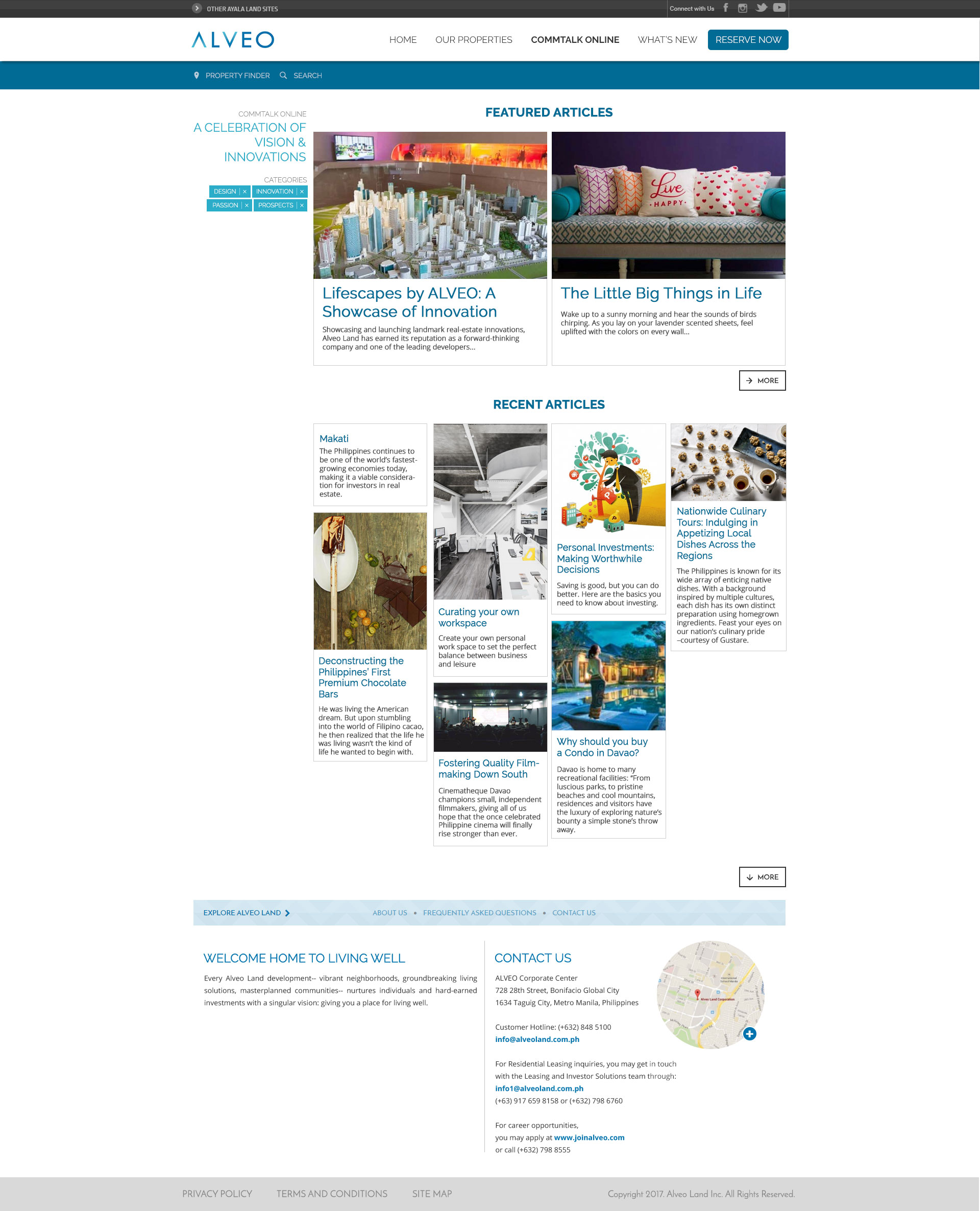
Alveo Land Website – Commtalk Online
Blog section
The blog section adopted a masonry layout, which allowed thumbnails of varying sizes and preserved visual interest. This layout supported a wide variety of article formats and was ideal for content-heavy pages.
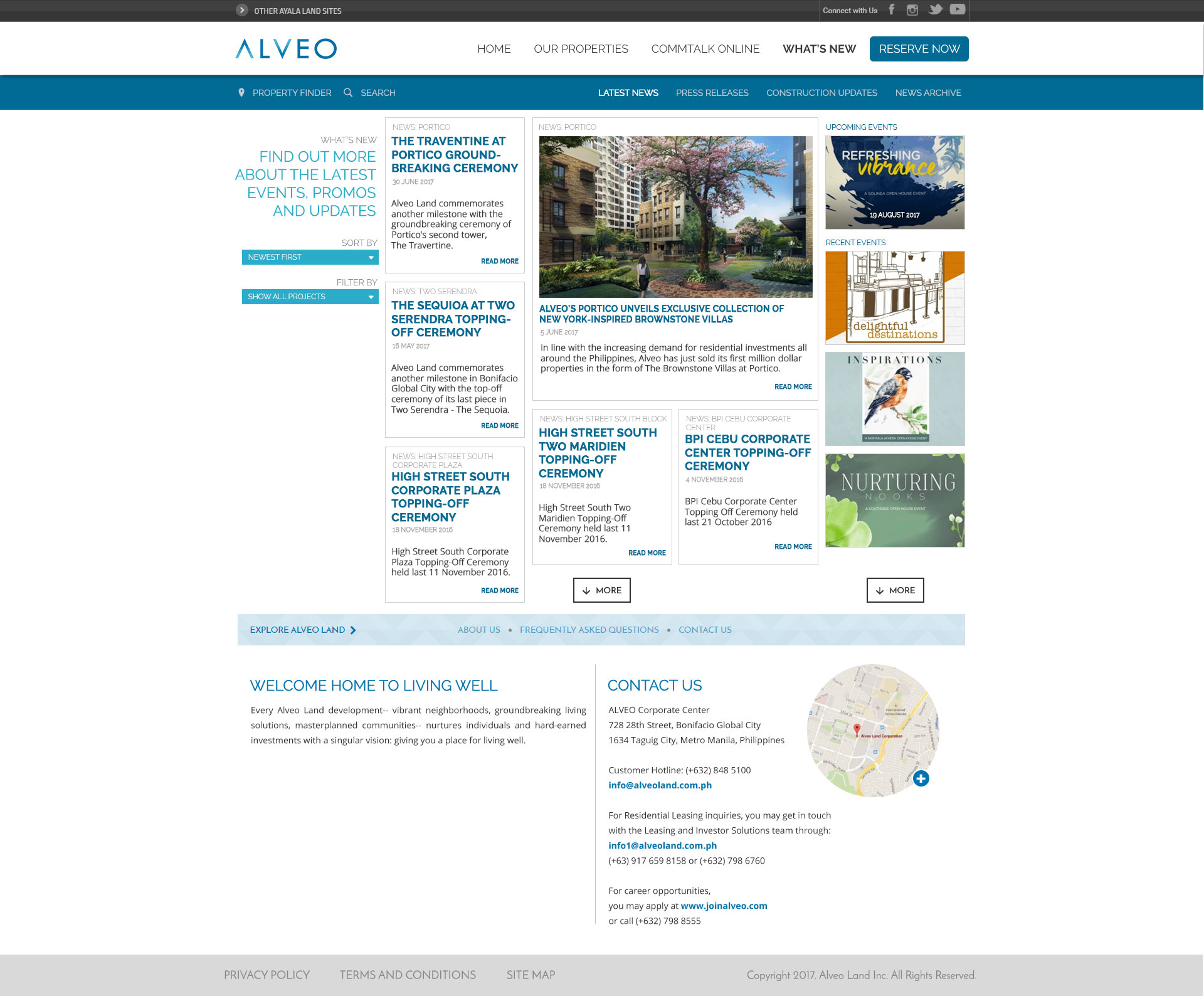
What’s New page
Newspaper layout
For the announcements section, we introduced a newspaper-style layout. This format gave updates a clear hierarchy while still maintaining space for additional callouts, such as event notices or social media highlights.
Bringing Order to Complexity
Through these design explorations, we aimed to bring logic and clarity to a previously cluttered layout. Rather than reinventing the brand, we offered a UI/UX solution that stayed true to Alveo’s identity while improving how users navigated the site.
By presenting modular, responsive mockups, we were able to demonstrate how content could be delivered more effectively—without overwhelming the user.
Disclaimer: This is not a personal project but is designed under BUILD for its client/s. All images and content belong to BUILD and/or the client unless otherwise stated.