I’ve been spending my free time in the past couple of days trying to design a new logo for myself. For the past several years, I have been using this logo, which is a monogram derived from the initials of my name:

Although I really like this logo/monogram and somehow I feel like this has already been branded into me, particularly as watermarks of older works on my DeviantART account; I wanted to make a new logo that is more superior.
The Problem
I also noticed that this is a very generic style, whereas a simple image search on Google could result in lots of similar search results. Here’s one we came upon as we drove up in NLEX, showcased on a billboard for the TPLEX project.

The Solution
Here are a few of my recent designs, in no particular order.
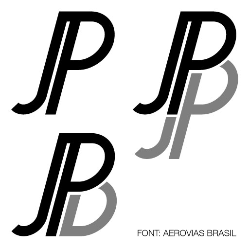
Slant//Shadow
For this monogram, I used the font Aerovias Brasil. I initially liked the slant and the thin stroke of the letters. I placed the P as close as possible to the J, using the serif-like extension on the P to create the sleek, modern look of the first variation. I then added a shadow to make a B for the second variation. The last variation was derived from the second one, except cropping the JP shadow to only show the bowl of the P.
This is one of my personal favorites.
Broadway Thin
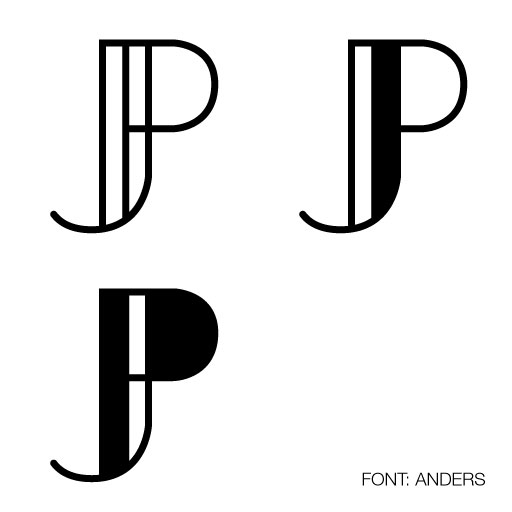
This monogram was created from the base font Anders by simply overlapping the letters J and P. The next two variations simply add a contrast to the shapes of the monogram.
In this design, I like both the first and second variations.
Fibonacci
The idea for this monogram came from combining and overlapping the J and the P from the font Andes. I initially liked the idea of the logo but then I realized that it kind of reminds me of the Pinterest logo.

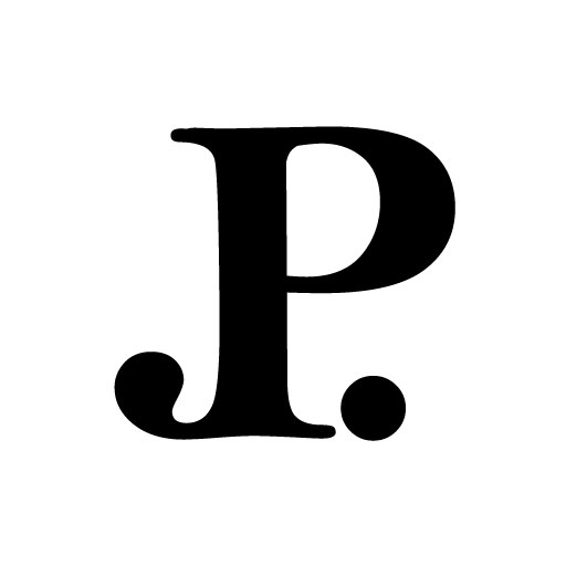
Serif Monogram
The base font used is a serif, but I don’t exactly remember which. In this design, I married the J to the P and added a period to balance out the descender of the J.
I like this monogram as well, but at first look, it’s more of just a P than a JP.
Infinity Chain
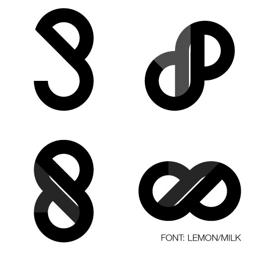
This is another of my personal favorites and to me, is a modernized version of my old logo. The base font used in this monogram is Lemon Milk and the idea came from overlapping two J’s and/or two P’s. Thus, a single link is born.
For the next variations, I then tried to repeat and rotate the JP monogram to form an infinity. I like how the JP monogram is subtle and that the overall design looks more like an infinity and a chain, or an S, for Suzie.
Serif Barcode
A simple idea by combining the letters J, P, B and B with even spaces in between letters. The descender of the J was extended and the bowl of the P was tweaked for a more uniform look.
This is also one of my personal favorites, but I’m only keen on using this for my portfolio if I decide to use serif on my main fonts for my website.

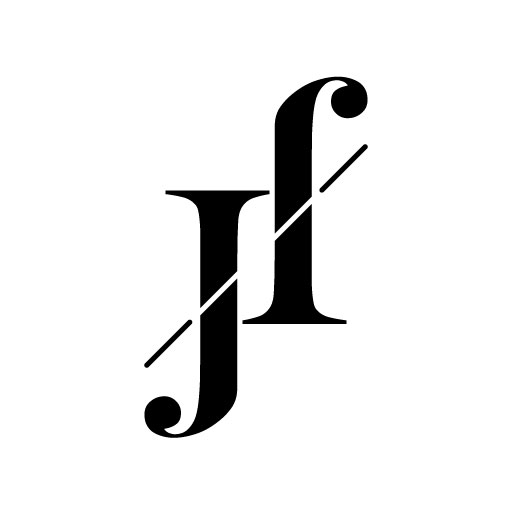
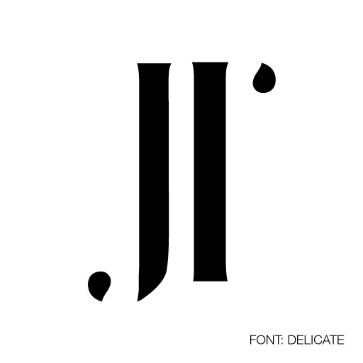
Ambigram and Pi Serif
Two more variations of my personal logo/monogram.
The Winning Design
Of all the new logos/monograms I did for myself, the Infinity Chain was my favorite. But there was still something off about it. With a few more tweaks to the chain, I was able to create the perfect logo for my website and a new brand identity for myself.

Do you know what I can do to protect my new and current logo?


